As you saw in the overview, VSI has a rich set of components that make up the user interface. We couldn’t do the more complicated elements among them justice in the overview, so here we’ll expand on a few components and show how in-depth how to use each.
Drilling Down on Dashboards
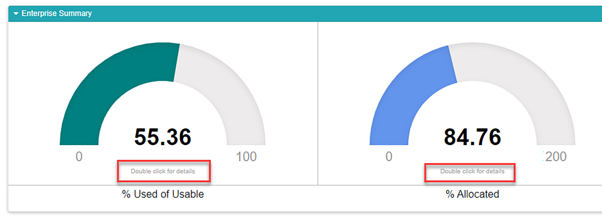
Many of the dashboards, which are usually presented on enterprise level screens, allow you to double click elements on the dashboard to get more details. There are instructions on the individual dashboard graphs that tell you when such an interaction is available.
Working with Most Graphs
Sometimes in our densely populated IT jungles, the data we hope to explore can get equally dense. VSI offers tools to help you hack through the undergrowth and get to just the data you need.
All graphs allow you to highlight any single data point by hovering over it with your mouse.
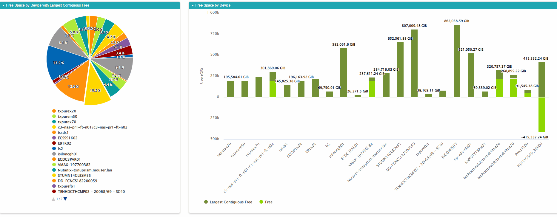
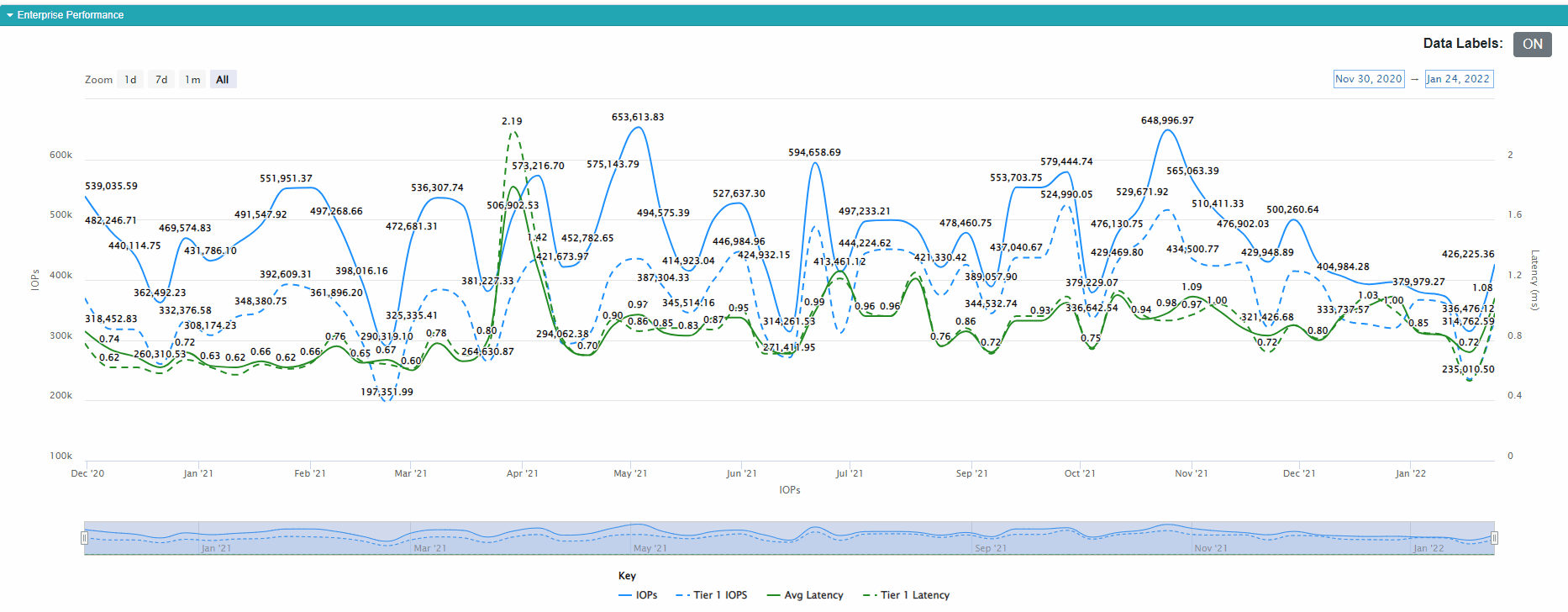
It is often useful to filter the data that appear on many graphs. You can hover over data elements in the legend of our graphs and the graph will highlight that element. You can also click to turn those elements on or off. In the below example, it maybe be useful to turn the two average lines off so we can focus on the data for our Tier 1 storage.
Turning Off Data Labels
Some of our graphs allow you to turn off the data labels, which are the numbers that appear with each data point. This can be useful when you run daily data collection and have many points on a graph. The numbers tend to run together making them difficult to read.
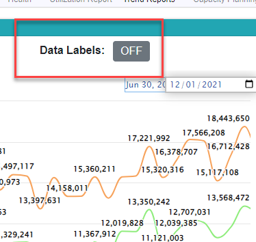
In these cases, you can turn off the data labels by simply clicking the data labels toggle. The data labels will disappear but you can still hover over the line to see individual values.
Working with Time Series Graphs
Time series graphs allow the same basic filtering as most other graphs, but they also allow you to interactively change the time periods under review. You ca accomplish this three different ways.
First, you can use the slider at the bottom of the screen. Using your mouse, grab the handles at either end of the blue time graph at the bottom and drag them to include the time periods that interest you. You can scrub the time area while dragging back and forth along the grid.

Secondly, you can precisely set the dates for the start and end of the series that interests you by using the time settings. Click the start and end dates and set them to the dates you’d like to see.
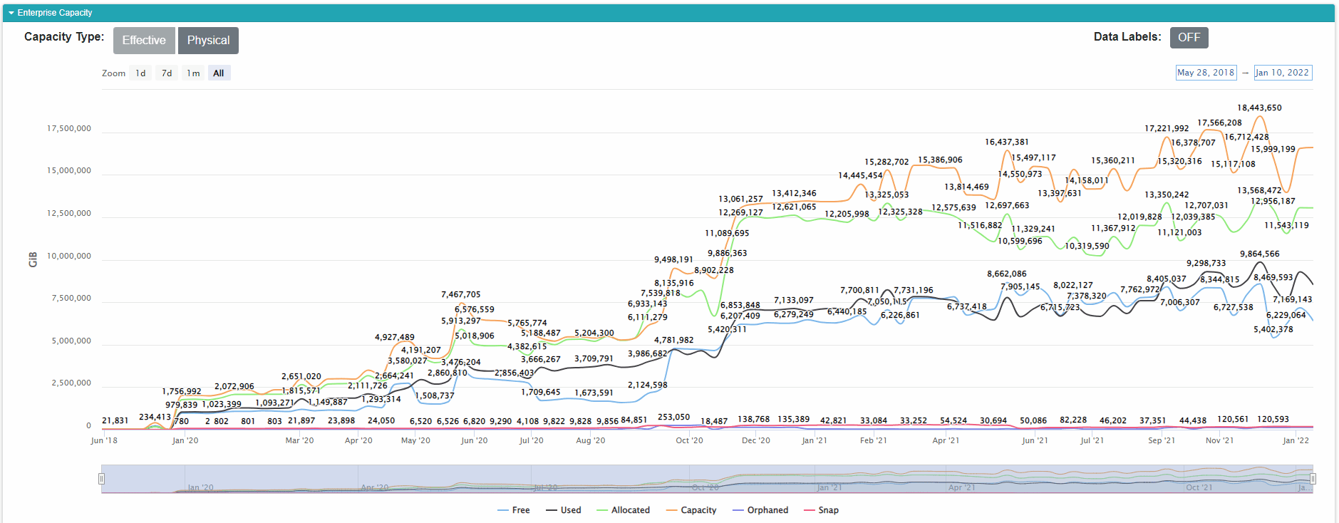
The third way is to use the quick zoom buttons on the upper left corner of the graph. You can select 1 day, 1 week, 1 month, or zoom all the way out to show all data points.
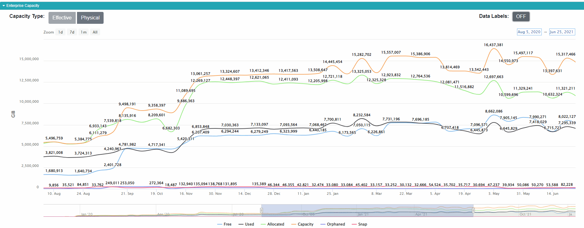
In any case, the graph zooms to allow you to see more granular data.
Pro Tip: This is especially useful if your organization uploads every day. In those cases, time series graphs can get crowded after a few months.
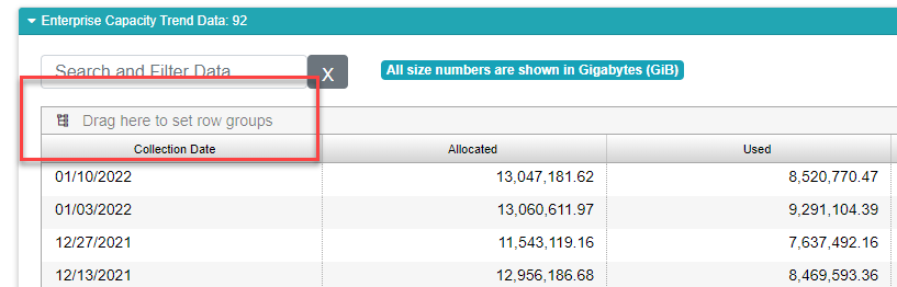
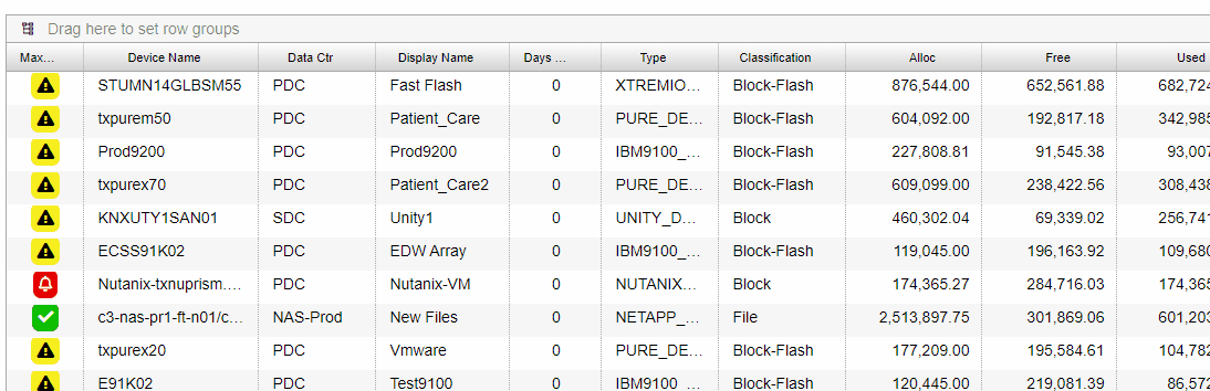
Working with the Customizable Data Grid
The customizable data grid is the interactive jewel in the VSI crown. It provides a lot of interactive features such as grouping, sorting, filtering, moving and resizing columns to suit your liking, and showing and hiding different columns. Once you get a grid set up the way you like it, you can save the layout. After saving a layout, you’ll see the report that way each time you login, regardless of whether you are using the same device.
Most grids are also searchable, and exportable should you want to slice and dice your data in a tool like Excel. On many reports, filtering the data will change the contents of any graphs displayed in the same report.
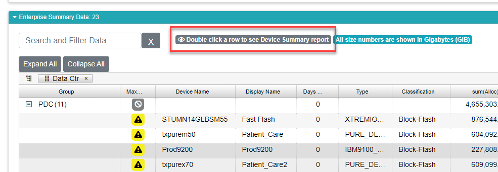
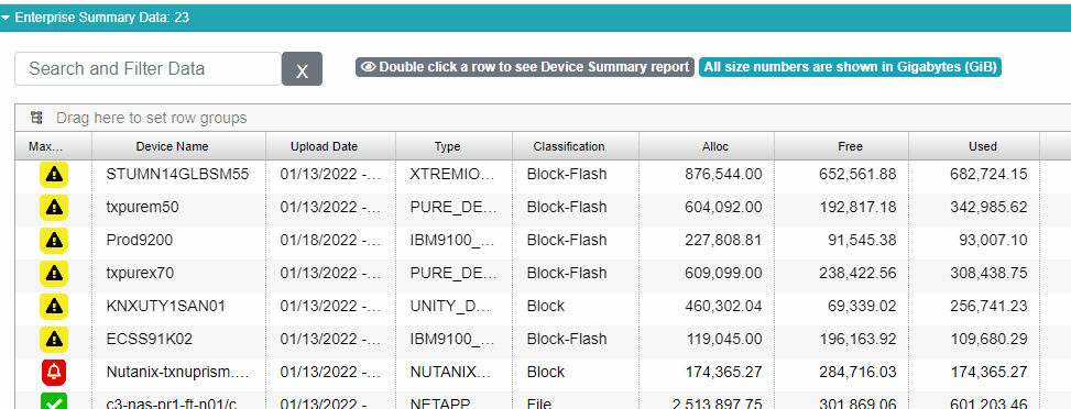
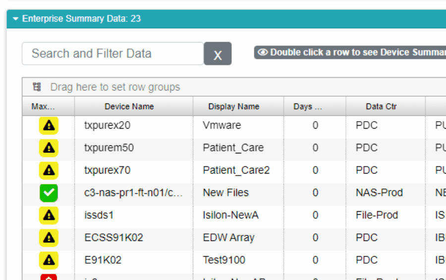
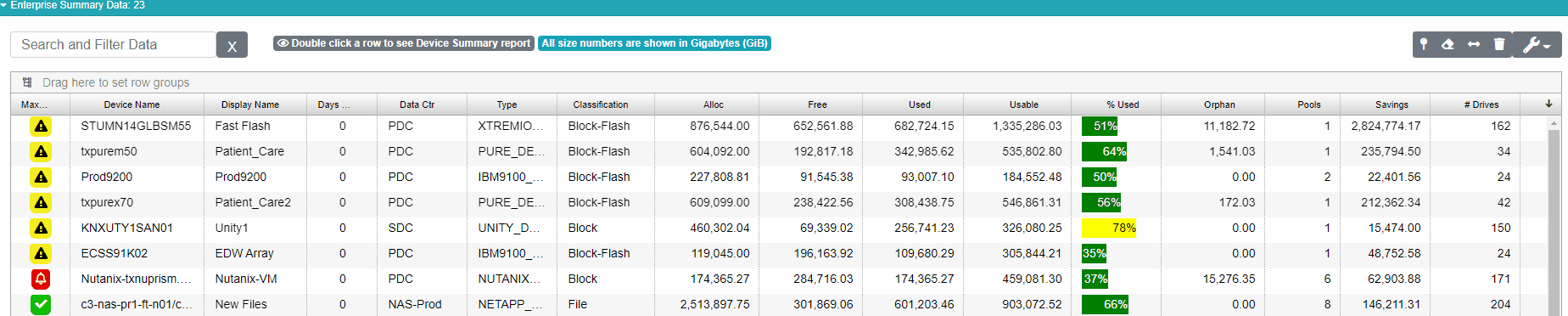
Many report grids, especially those at the enterprise level, allow you to double click rows to view a more detailed set of reports concerning the item you selected.
Let’s look at the major features on the Customizable Data Grid.
Drilling Down for More Detail
Some data grids, particularly those displayed in enterprise reports, all you to double click a row on the report to view more detailed reports. You can tell which grids support this by finding the notification next to the search field. If the grid displays this message (below), it supports drilling down. If there isn’t a level of detail below your current report, this badge will be absent.
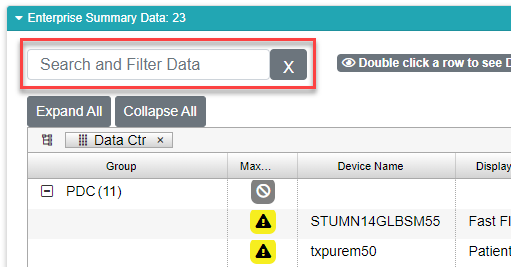
Searching the Data Grid
You can search the data within the grid using the search field. Type in your search term, and if it is found within any cell in the grid, you’ll see the grid limited to the results. To clear the search result and view all data again, just clear out the search field by clicking the X button next to the field.
Sorting Data
Most columns are sortable. To accomplish this, simply over your mouse over the column. When you do this, a hamburger menu shows up which will allow you to access more features available on that column. Sorting, though, doesn’t use the hamburger menu. Instead, click anywhere in the column header, except for the hamburger menu. Clicking a column once sorts the data in the grid in ascending order. An upward facing arrow will appear in the column header to indicate this is happening. Click again and the data are sorted in descending order, and the arrow will change to a downward facing arrow. Click one more time and the data goes back to being unsorted.
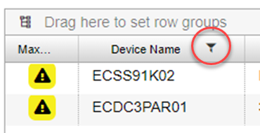
Filtering Data in a Column
The Customizable Data Grid in VSI allows for sophisticated filtering on column data. The controls that are available are different depending on what kind of data are in the column. In any case, you can access the filtering options by hovering your mouse pointer over any column header. When you do this, a hamburger icon (three horizontal lines) appears in the left side of the column header. Clicking the hamburger opens the menu.
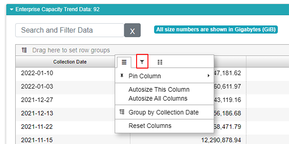
The column options menu has three tabs. The first tab controls some basic options for the column. We’re interested in filtering, so click the second tab with a funnel icon. What you see next depends on what kind of data are in the column.
Filtering Dates and Numbers
In the example above, we’ve selected to filter on a column with dates, so our options look like this:
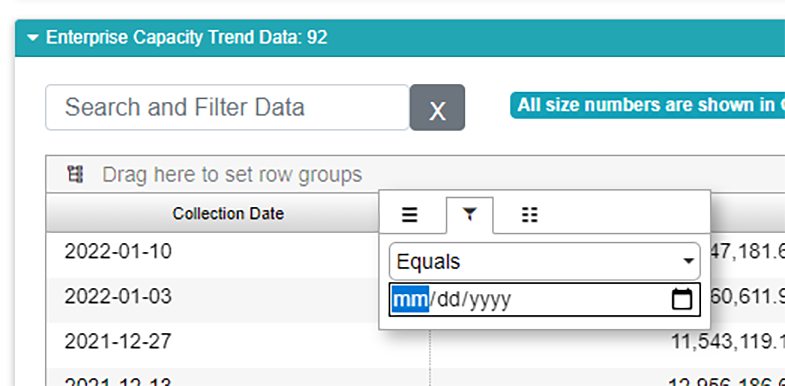
We’re looking at a drop down menu that allows for traditional operations on numbers:
Equals
Greater Than
Less Than
Greater Than or Equal To
Less Than or Equal To
Not Equal To
In Range
Beneath that is a date field. You can type a date in, or you can select a date with a calendar by clicking the calendar icon.
If you select “In Range” you get a second date field allowing you to set a start date and an end date for the range.
If the column you selected contains numeric data, the controls are the same, except you aren’t presented with a date picker.
Filtering Text
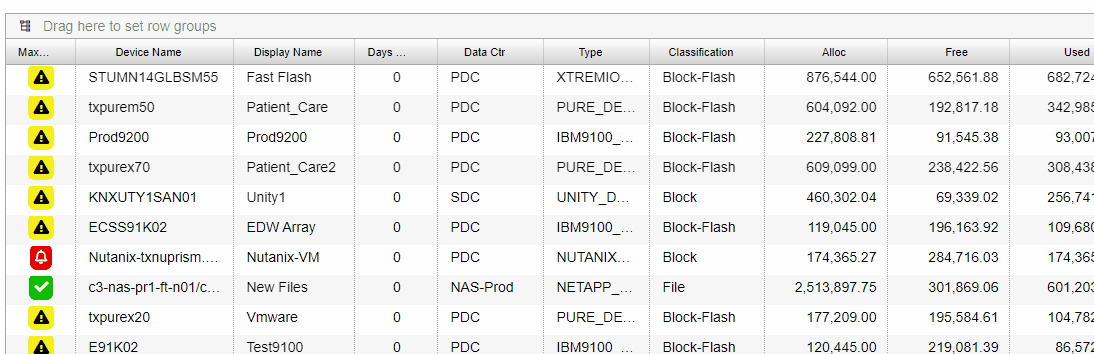
If the column you selected contains text, the filtering options are similar to those found in Microsoft Excel.
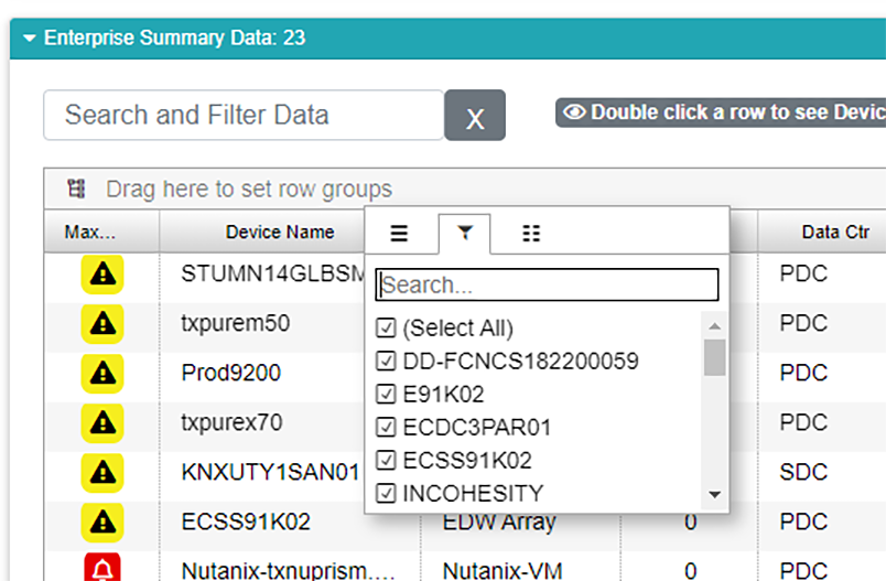
Here, we can select exactly which text elements we’d like to see. Use the check boxes and the search to zero in on the data that interest you. Below, I’m searching for all storage devices that start with “EC”.
Once a filter is applied, you’ll notice a funnel icon appears in the column header to let you know a filter is in use.
To clear a filter, perform the same steps in reverse.
Grouping Data
Many reports allow you to group your data by one or more categories taking from column on the data grid. Grouped data are generally subtotaled by the grouping you select.
To group data in a report, first make sure the report supports grouping. You can tell grouping is supported when you see the grouping bar at the top of the data grid.
To group data, select a relevant column and drag it by the column header, then drop it in the grouping bar.
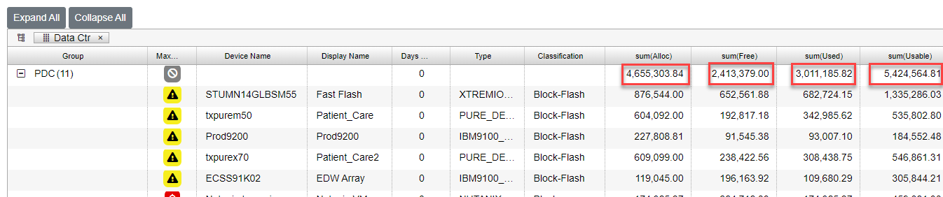
Once the grouping is in place, you’ll find numerical columns have been summarized:
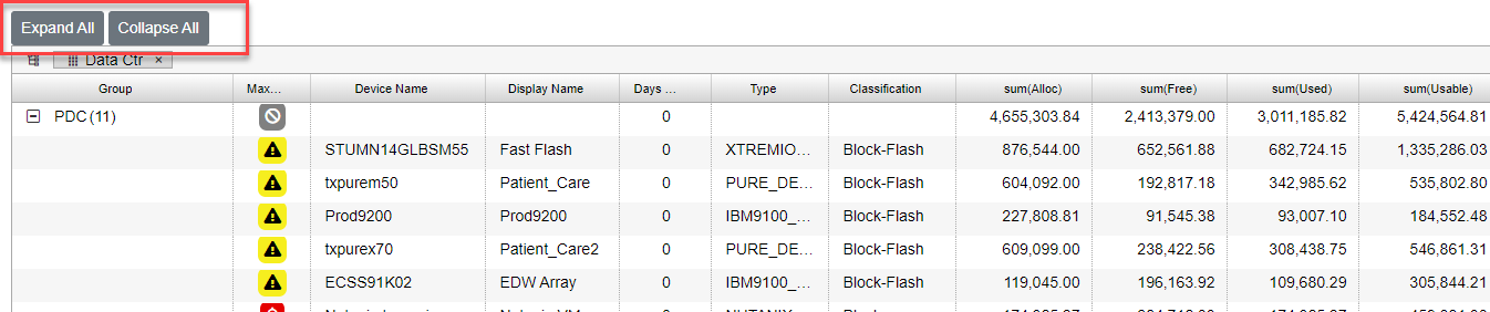
You can close up the groups to see all the groups together with their summary lines, or you can expand a group to see what’s inside it. You can do this group by group by using the + / - markers next to the group.

If you’d like to open and close all the groups at once, use the Expand All and Collapse All buttons above the grid.
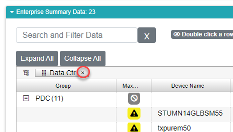
To clear the grouping, just click the x in the grouped field in the group bar to remove it. Once you’ve remoted all the groupings, your data will appear as it was originally displayed.
Units of Measure
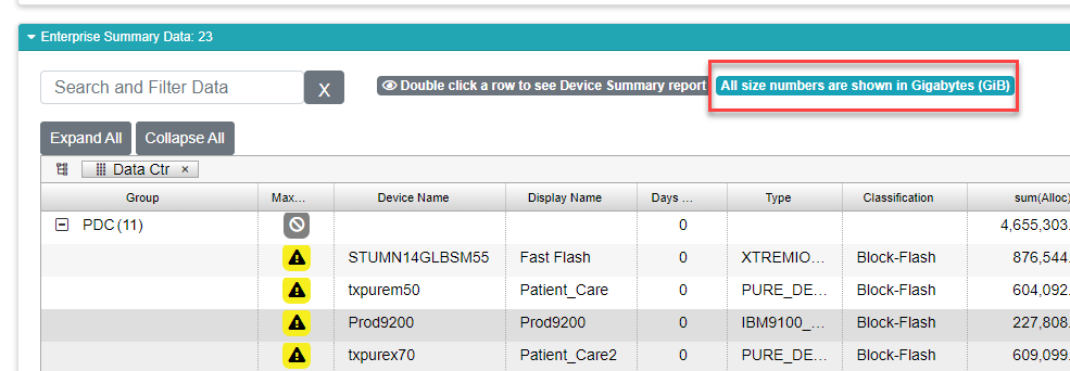
By default, all size numbers on all reports are expressed as the SI unit gigabytes, expressed as GiB. You can change this during the onboarding process. You can tell what unit you’re using by checking the display above the data grid.
Rearranging Columns
You can rearrange the columns if you’d like. Simply drag the column header, and drop it wherever you’d like it on the grid.
Showing and Hiding Columns
What you see on most grids isn’t always all that is available. Many grids have hidden fields. Similarly, not all our users care about every field on our standard reports. You have the ability to customize most of the reporting grids in VSI. To do this, click the wrench button above the data grid. This will show the Grid’s configuration drawer. Once it’s open, you check and uncheck any column you’d like to show or hide respectively.
Once you have the fields you want, click the wrench again to close the drawer.
Saving and Resetting the Column Configuration
Let’s say you spent the last 30 minutes obsessing over the perfect grid layout. Who can blame you? We certainly won’t judge. The problem is, if you navigate away from the report and navigate back, all your hard work is for naught. The report defaults back to it’s original configuration.
Fear not, intrepid data slicer! You can save your layout by pinning your columns with the pin button.
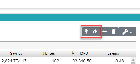
If you’d like to reset back to the original layout, click the eraser button right next to the pin.