How Your Data are Organized
Data from your IT systems are organized in several layers, depending on the type of data we’re observing. Most data is displayed in two layers: the enterprise layer, and the detail layer.
The enterprise layer provides you with a rolled-up summary of your data, often with a listing of the individual data elements that make up that summary.
For example, the Enterprise Summary report shows all storage devices regardless of vendor, data center, storage tier, and other factors you could use for analysis. All the device data points are “rolled up” into an overview of all your storage devices.
To get to the detail layer on the Enterprise Summary, as with most enterprise views, you can double click the system that interests you using the Customizable Data Grid. Doing this takes you to a new set of reports that focus on the individual storage device you selected. You’ll also see the breadcrumbs towards the top left of the screen update to allow you to navigate back to where you started.
The Virtual reports allow you to view data related to virtualization assets such as hypervisors and virtualized storage allow you to drill down through many levels of detail. This works the same way, there are just more layers.
Interacting with Your Data
VSI is a very interactive application with a visually rich collection of navigational and reporting components. By default, the first screen you usually see is the Enterprise Summary. Let’s start by orienting you to what’s on the screen.
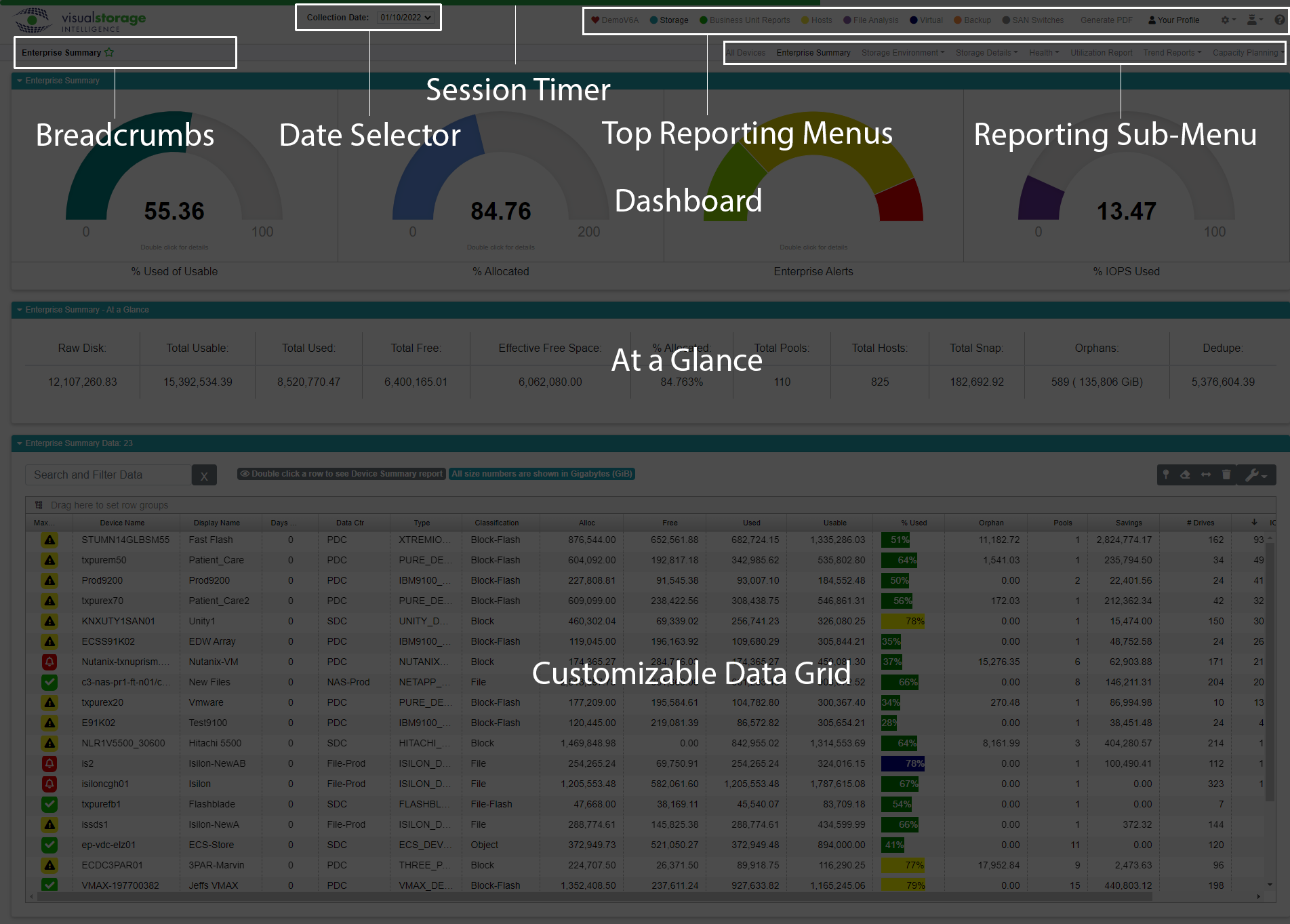
Top Reporting Menus
VSI has dozens of insightful reports that allow you to explore and drill down for more detail. The main navigation can be done using the toolbar at the top of the screen.

Let’s take a closer look.

Here we the different reporting areas supported by VSI. The application is constantly growing and improving, so in the future you might see more in the menu. Note each area of reporting has a colored dot next to the selection. You’ll see those colors tied to the area of the application you’re in at any given time. You can see the teal colored dot next to Storage in the menu. That color matches the different titular areas of the report screens.
The ❤ represents your organization, so you’ll always see your company’s name next to our heart.
Session Timer
Above the menu bar, running along the full width of the top of the screen is a green line. The green line represents your session time remaining. Since security is near and dear to all our hearts, users are automatically logged out after 30 minutes of activity. The bar get shorter, and will change color to yellow, and then red, the closer you get to the time-out. The timer resets each time you switch reports.
Pro Tip: If you start running out of time, you can click on the bar itself to reset the countdown.
The Date Selector
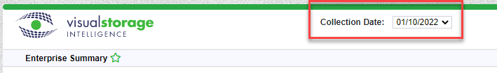
Reports in VSI are all shown based on the date the data were collected. You can change the date you’re viewing using the date selector. VSI keeps data for 13 months, and supports daily or weekly data collection.
The date selector disappears when you’re viewing reports where you can’t use it. A great example is any trend chart. Trends are designed to show you a time-scale report going back a maximum of 13 months. As such, it' doesn’t make sense to change the date.
Reporting Sub-Menus & Breadcrumbs
Beneath the main menu bar is a second menu bar containing the individual reports available in the area of reporting you’ve selected.
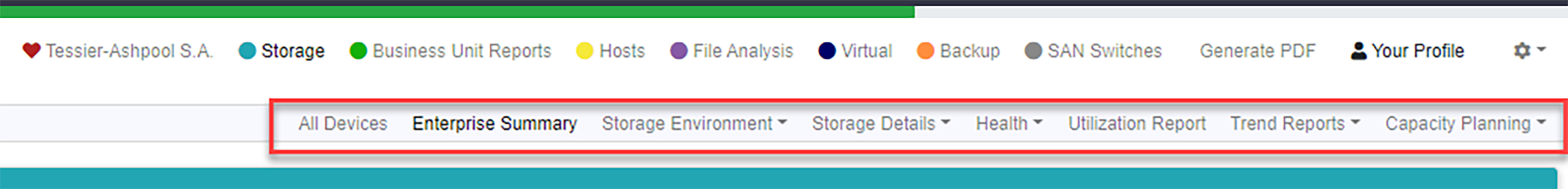
As you click the colored dot menu items in the main menu, the sub menu bar changes. The right side of the sub-menu bar will contains menu items for the different available reports.
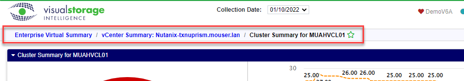
The left side will show you a set of navigational breadcrumbs allowing you to navigation backwards. This is particularly handy when you drill down into different levels of a report. Perhaps the richest example in VSI are the reports in the Virtual area. This set of reports allows you to analyze virtual environments like VMWare and features a lot of drill-down compared to most of the other areas which only go two or three layers deep. The breadcrumbs save you a lot of time when you want to go back to where you started before you drilled down.
Common Reporting Elements
As you use VSI, you’ll find a number of common elements used on different screens. Think of them as “reporting Legos”. We use these components to build and display your reports.
Dashboards
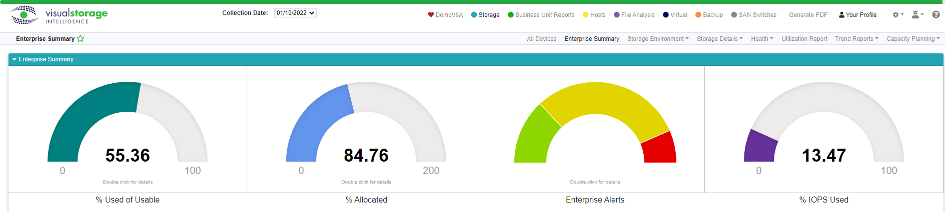
Dashboards are usually at the top of the screen on every enterprise view in VSI. They provide a graphical view of the most salient summarized data points for each report where they appear. Many of these dashboard graphs are interactive. Those that are have instructions beneath them to tell you what is possible with that graph.
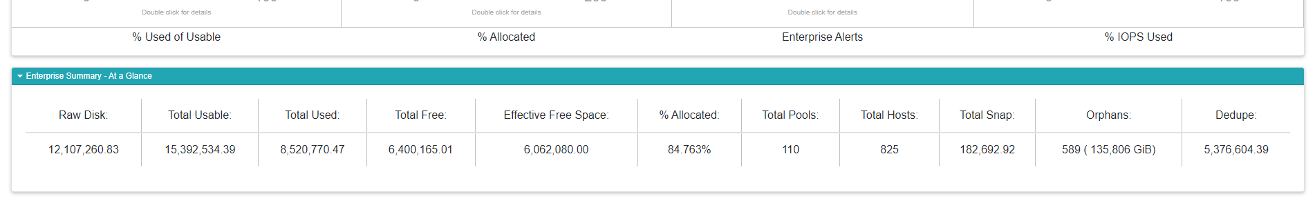
At a Glance
These are single-row tables that give you a quick overview of the data in numerical, rather than graphical format. They’re used to show summary data for the raw data in the report.
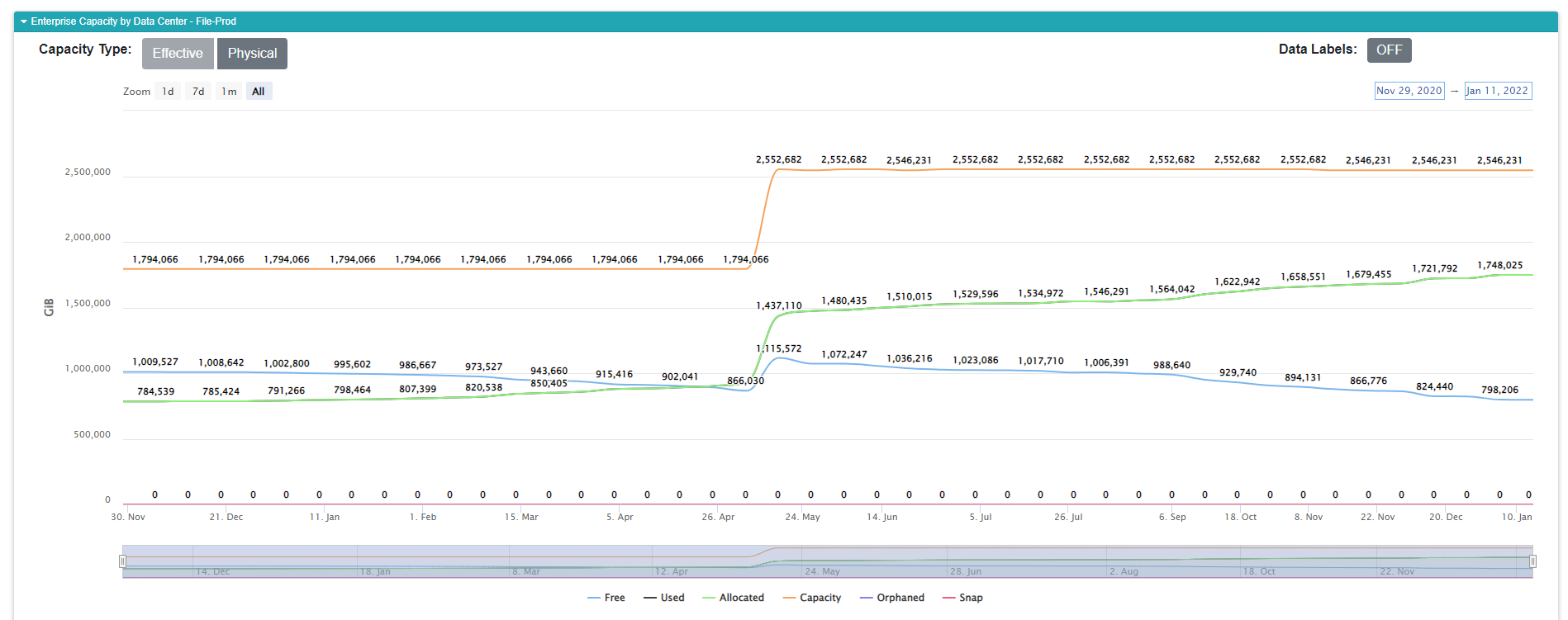
The Graphs
These probably need little introduction. The graphs are the bread-and-butter of reporting in the VSI application. We use a number of different kinds of graphs to help you learn the stories behind your data.
Pie Charts are used to show ratios of a part to a whole. For example we’ll show you the percentage of used or allocated space compared to the usable free space using a pie chart.
Line Charts are used to show you trends over time. Many of our line charts have two axes, one showing capacity, the other performance. You’ll see guidance on how to read these charts within the documentation for the individual reports.
Bar and Stacked Bar Charts allow for a side-by-side comparison. For example we will show you the breakdown of space used by different device types as a bar chart.
Many of the graphs are interactive and allow you to modify what is displayed in the graph. For example, you can turn off the lines using the legend in most of the graph types. Many graphs have drop-downs that allow you to see a different perspective on the same data, for example, switching from a trend chart that shows all data-centers to viewing a single data center’s trend.
Customizable Data Grid
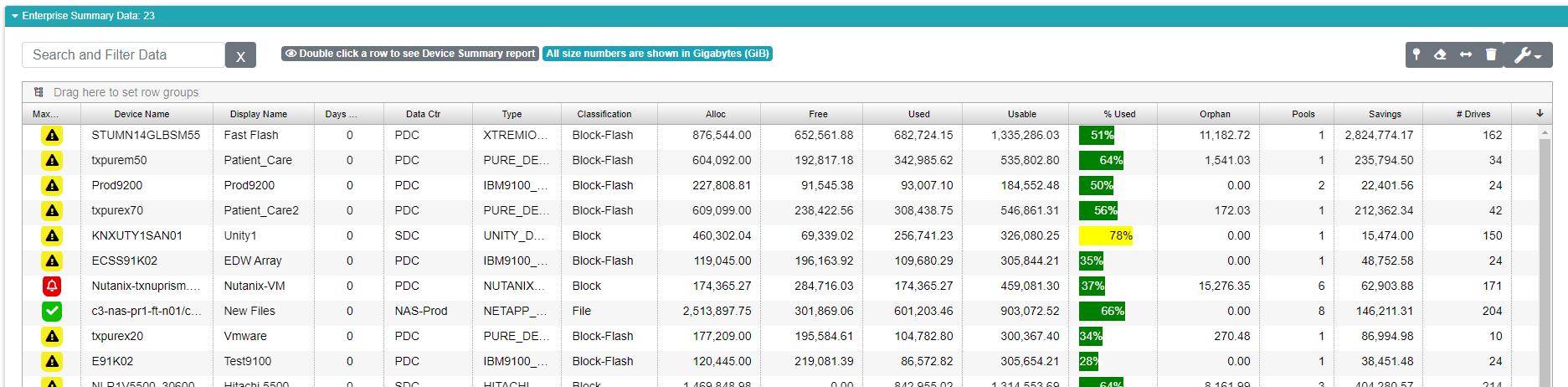
The grid is designed to show you the raw data used in the report. It works similarly to a spreadsheet, except you generally can’t edit the data. You can, however, customize the grid to your liking by changing the order of the columns, and turning columns on and off. You can also group your data in different ways to change the way you see it, and to give you different types of information.
Most of the grids allow you to double-click a row to view a more detailed report. For example, double clicking a device in the Enterprise Summary report takes you to a set of reports focusing exclusively on the device you selected. Look for badges above the grid to tell you what is possible with that grid.
There’s more to the grid than we can put in this overview. Be sure to check out the Customizable Data Grid documentation to get the full store of it’s rich features and capabilities.