Overview by Data Center
The Storage Environment by Data Center shows you a graphical picture of the systems within your data centers. These screens offer a dense and interactive experience while maintaining a visually simple appearance.
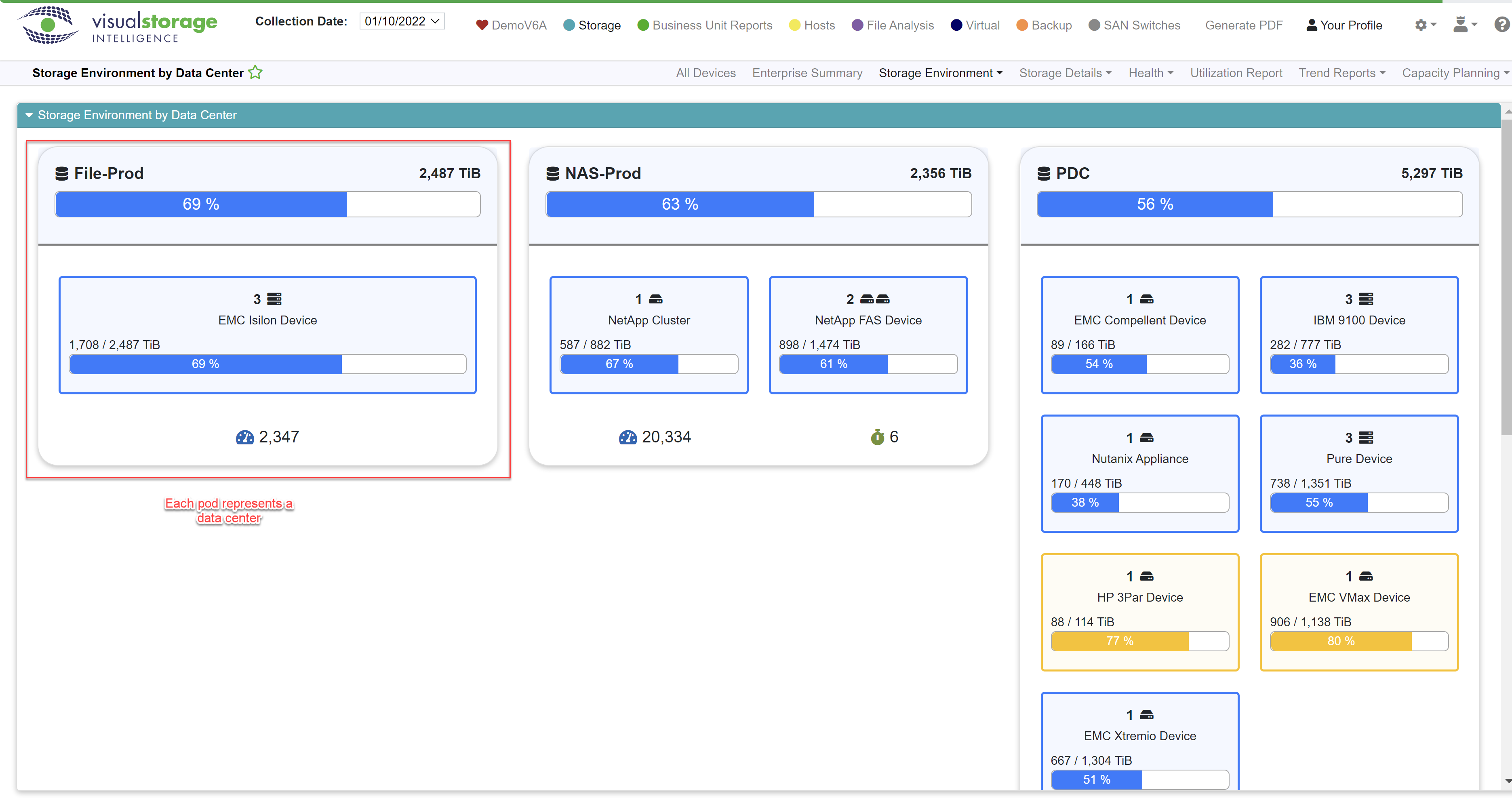
The screen is broken down into pods. Each pod represents a data center. Within each data center we can see a roll-up of the represented systems. Let’s look at the data center in the middle called NAS-Prod.
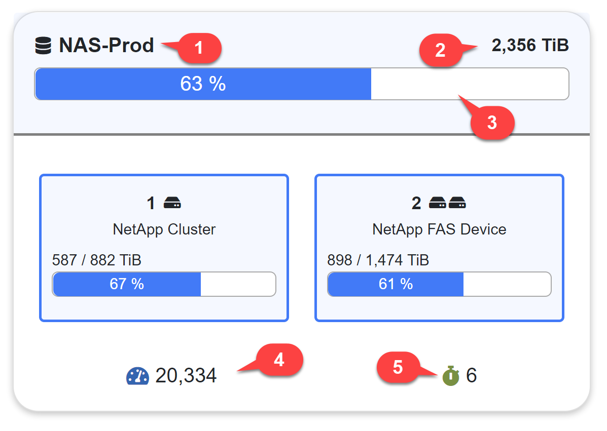
This is the name of the data center
This number represents your total usable space within all systems in the data center.
The bar graph represents the percentage of used space based on all systems in the data center.
The number next to the speedometer represents to average (weighted) IOPS for all systems in the data center.
The number next to the stopwatch represents average latency across all systems in the data center expressed in milliseconds (ms).
You can hover over the speedometer and stopwatch icons if you forget which metric goes with which icon.
Next, let’s look at one of the system types.
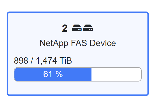
This shows us that we have 2 NetApp FAS Devices within our data center. The icons next to the number will further designate there being two systems of that type. If you have 3 or more of the same system type, the icon will only show a maximum of three, but obviously the number will show the true amount.
We can see that we are using 61% of our total usable space which translates into 898 out of 1,474 TiB of space between the two systems.
You can click anywhere inside the system type to see deeper breakdown of our two systems.
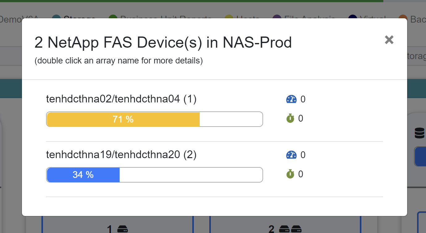
Having clicked on the box we were just looking at, we get a dialog that shows us the breakdown for the type. Here we can see that we have two NetApp FAS devices in the data center NAS-Prod.
This time we can see the individual names of those devices and we can see usage data for each. We’re approaching our threshold on the top array (tenhdcthna02/tenhdcthna04), so that one is colored yellow. Once we meet or exceed threshold, which by default is usually 80%, the graph turns red. Percentages well below threshold are rendered in blue.
We also show average (weighted) latency and IOPS.
Note the instructions beneath the header that indicate you can double click an array name for more details. Double clicking the array name will take you to the array details report for that array.
You can dismiss the dialog by clicking the X in the upper right corner, or by clicking anywhere in the darkened area around the dialog.
Overview by Classification
The individual components of this report are the same as those found in the Overview by Data Center report. Overview by Classification breaks the same information down by the classifications rather than by data center.
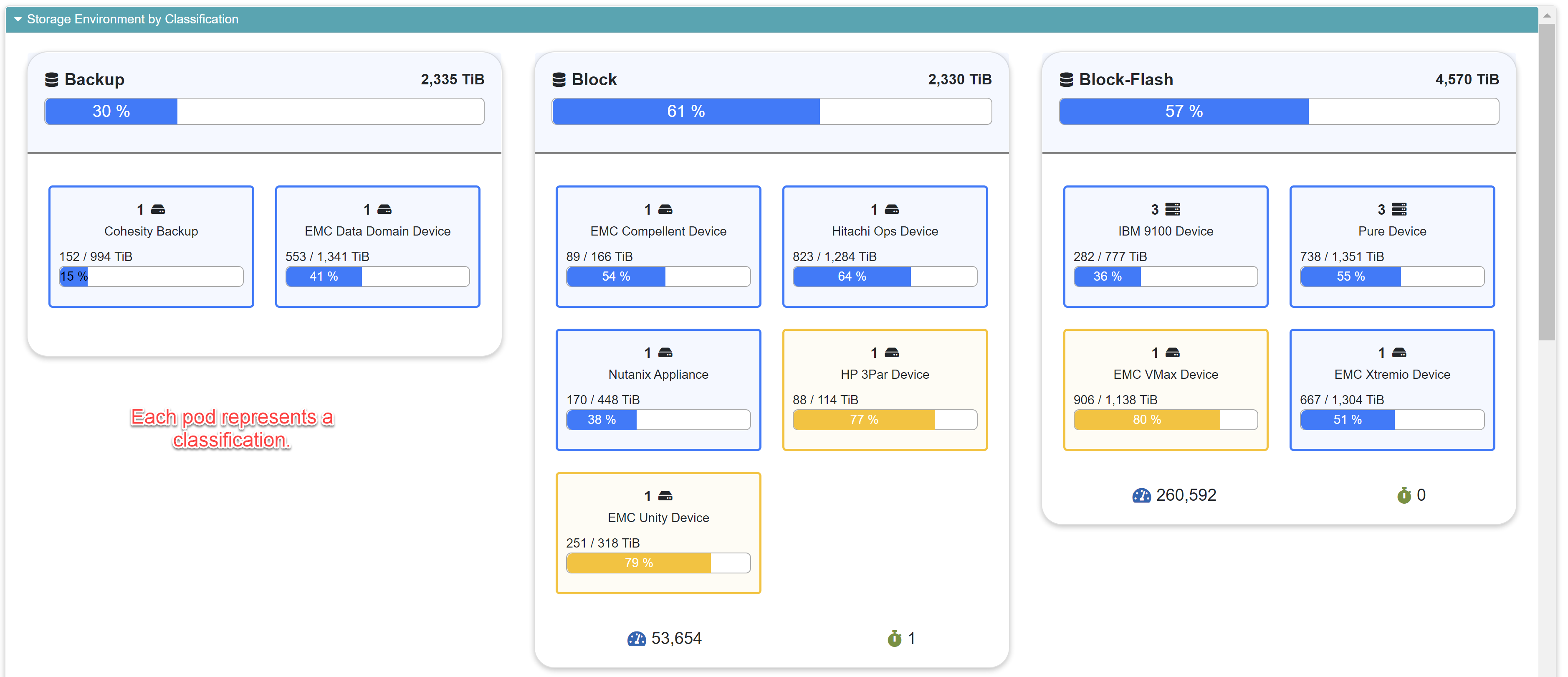
Here we have three classifications visible. If your IT environment is highly heterogenous, you’ll likely see a lot more pods. You can scroll down using the scroll bar on the right edge of the screen or by using your mouse wheel.
The meanings of the numbers and icons are explained above in the section on Overview by Data Center. This report works the same way, it just arranges the data differently. There are lots of interactive features here to allow you drill down into your classifications, so be sure to read up on those features above.
Overview by Geography
As with the other overview reports in this section, this report arranges your view by geographical regions based on your business unit data. Read the documentation on the Overview by Data Center report at the top of this page.
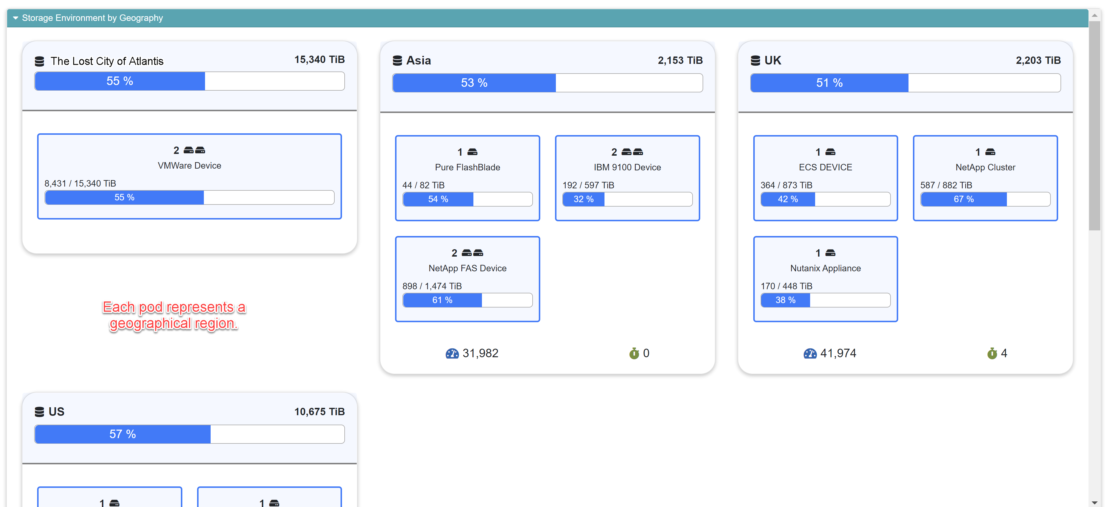
The meanings of the numbers and icons are explained above in the section on Overview by Data Center. This report works the same way, it just arranges the data differently. There are lots of interactive features here to allow you drill down into your classifications, so be sure to read up on those features above.