Like so many reports in VSI, the first three capacity reports follow a similar pattern in terms of how we present the data. Here, we are going to present three separate breakdowns of your capacity based on your allocation strategy. If you use thick provisioning, also called fat provisioning or thin provisioning. Thick provisioning is a simple allocation method that assigns a set of users, maybe a department, with a fixed amount of storage space for their use. The allocated amount is the same regardless of how much space they use. If you have 1 TB of physical space on an array, you can allocate 10 departments 100 GB of space and that’s how much they’ll have regardless of whether they actually use 1, 50, or all 100 GB of that space. You can’t over-allocate when you’re working with thick provisioning because each allocation takes a chunk of the usable storage. It’s a zero sums game. Each department is guaranteed their 100 GB, but let’s face it, most departments will only ever use a fraction of what they’re allocated.
In a thin provisioning strategy, you can provision more storage than you actually have. The same 10 departments can be allocated 100 GB of space, but this time the array only has 700 GB of physical storage. Because the allocations add up to more than 700 GB, the array is said to be overallocated. This isn’t a bad thing, it’s good. The departments are using more of the assets the company paid for, and in our simple and admittedly small example, your company bought less storage. This is a lot like how a bank works. The cash in the vault at the bank is always a lot less than the total deposits accepted by the bank. If everybody goes to withdraw their money at the same time, the bank will run out of money long before the last depositor in line gets their cash. But this almost never happens. In short, thin provisioning is a more efficient use of resources. You can buy less storage and use more of what you have rather than buying it all “up front” and having it sit largely unused. Since you have a tool like VSI, you can keep an eye on these reports, and others like the Business Unit Forecast Report. They’ll tell you if there’s an incipient run on storage.
Did you know VSI offers Capacity Planning as a Service? This service entails having one of our storage experts work with you, using VSI, to develop and maintain your company’s capacity plan.
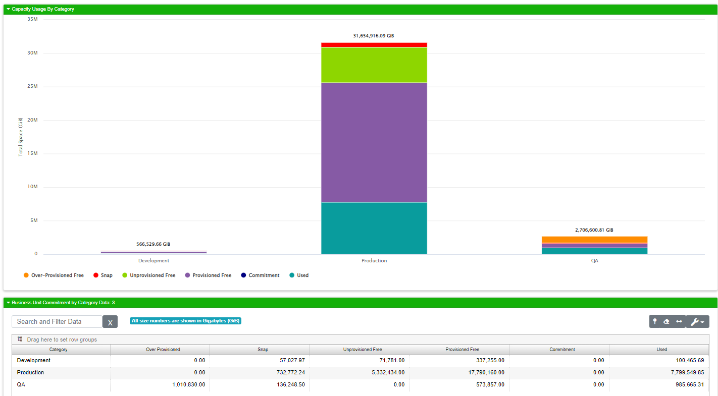
The first three business unit capacity reports display stacked column charts like this one:

The sections of the columns are consistently colored on all reports using this kind of display. Over provisioned space is always drawn in orange. Snap is always red, because wasting space on snaps is bad. Unprovisioned free space is always green. Provisioned free space is always purple. The committed space is always dark blue. Used is drawn in teal.
Capacity Summary
This report gives you a summarized view of all your storage in terms of allocation. The grid will only ever have one row and the data in that row is what’s graphed in the stacked column chart at the top of the report.
Field |
What It Means |
|---|---|
Snap |
The total amount of snap space within the enterprise storage as a whole at the time of collection. Ideally, this number should be very low compared to the other numbers. If things are going well for you, there will be a number in the grid, but the red area on the graph will be virtually invisible. |
Overprovisioned Free |
This tells you how much space of your over-provisioned allocation is free. If you are not overallocated, this number will be zero. |
Unprovisioned Free |
This tells you how much usable space is available that has not been provisioned. |
Provisioned Free |
This tells you how much usable space has been provisioned. |
Used |
This is the overall used number independent of how the space is allocated |
Commitment |
Storage that is reserved for future allocation but not yet installed |
Capacity by Category
This report shows your allocation by category. Your categories are defined in your business unit upload data and are site / organization specific. Some of our customers create categories for development, production and QA. Here we can see an example of such an environment:
Capacity by Application
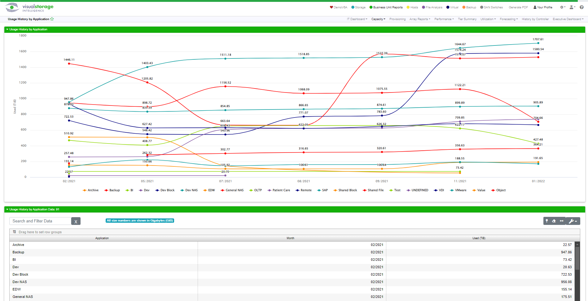
This report shows your allocation by application. This report can be susceptible to skewing within the graph. This happens when you have an application that uses significantly more capacity than everything else. The easy example is a client that uses Cohesity Backup. In this case, you can see the Cohesity numbers mask the rest of the graph data. You can turn off any of the data lines by filtering on the Application field. The animation below shows how this is done using the filter settings for the Application column in the customizable data grid.

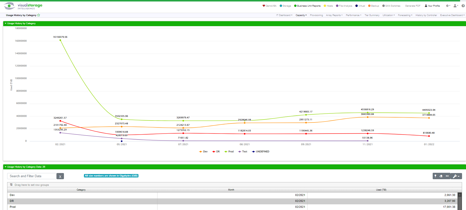
Usage History by Category
This report shows a trend of capacity usage over time based on category.
Usage History by Application
This report shows a trend of capacity usage over time based by applications.
Capacity Detail
The Capacity Detail report is designed to give you all the hard numbers on your current capacity position. There’s no graph here, but you can do a lot of analysis with this screen by using the customizable data grid’s grouping and sorting features.
Field |
What It Means |
|---|---|
Data Center |
The data center for the current line of data |
Array Name |
The name of the array for the current line |
Category |
The category for the current line |
Application |
The name of the application for this line of data |
Usable |
The total usable space on the array |
Used |
The amount of space used on the array expressed as a number (e.g. GiB) |
% Used |
The amount of space used on the array expressed as a percentage |
Provisioned Free |
The amount of provisioned free space on the array |
Un-Provisioned |
The amount of un-provisioned space on the array |
Over Provisioned |
The amount of over provisioned space on the array |
Allocated |
The amount of allocated space on the array |
Snap |
The amount of snap space consumed on the array |
Capacity Trend DEPRECATED
Capacity Trend shows you a trend report with your capacity numbers drawn in an area line graph. This report is deprecated in favor of newer reports and features. It will be taken out of the next major release of VSI.
Capacity Planning by Data Center
Capacity Planning by Data Center allows you to perform some “what-if” analyses using your current capacity grouped by data center as a starting point.
Capacity Planning by Classification
Capacity Planning by Classification allows you to perform some “what-if” analyses using your current capacity grouped by classification as a starting point.