Trend reports are designed to show you various storage trends over time.
Trend reports do not have a date selector available since they show data from all periods you’ve collected so far. Trend data go back a maximum of 13 months.
Many trend reports allow you to change the focus of the x-axis on the graphs. For example, the Enterprise Capacity by Data Center report allows you to switch between Effective and Physical capacity. Look for buttons in the upper left corner of the graph for the availability of this feature on trend reports.
Trend data can be densely packed on the trend graphs, especially if your organization has collected data every day for over a year. We have a few tools on our trend graphs to help with this. First, you can turn the data labels on and off. The data labels are the numbers that appear above each data point. They tend to run together when the graph is very dense. If you turn off the data points, you can still hover over the data point you are interested in to see the number for that point.
At the bottom of many trend graphs is a selector that allows you to zoom in on a particular time period so you can focus on the data. The same kind of focus can be achieved by selecting specific dates from the date selectors or clicking one of the pre-defined zoom buttons. See our section on Navigating Your Data for more information on how you can interact with charts and graphs.
Enterprise Capacity Trend
This report is designed to show you six metrics graphed over time that relate to your overall enterprise storage.
Free
Used
Allocated
Capacity
Orphaned
Snap
Obviously, we want these last two metrics to be at or near zero. Orphaned space represents space that is allocated but not attached to any host. Snap indicates space that is utilized by snapshots which are meant to be temporary backups that allow you to roll back to a point in time. Both are considered wasteful so if you see significant lines in these two metrics you have an opportunity to free up some space for more useful endeavors.
The capacity line should be well above the others. As used and allocated rise to meet capacity, it means you will need to start thinking about freeing up space or adding more storage to your environment. If you’d like to see a projected forecast on when that intersection might occur, check out our forecast report. For guidance on freeing up space, check out the Enterprise Storage by Tier report. This report will tell you how much space you have within each of your storage tiers allowing you to see where you might be able to move some of your data. Next, check the File Analysis reports which show you where you are storing files that haven’t been accessed in a while. You can often find space by moving files that haven’t been accessed within the last year to some cheaper tier of storage or to an inexpensive cloud option like glacier storage on AWS or Azure.
It is fairly common for the used and allocated lines to be nearly identical. If you only see three of the six lines, remembering snap and orphaned values should be near zero, try turning off the allocated line to see if the used line is underneath allocated.
Capacity by Data Center Trend
This is a variant of the Enterprise Capacity Trend report. All the explanations for the graphs offered in the documentation of that report hold true for this one as well. The difference is this one is broken down by device type. The customizable data grid shows a selector for picking the device type you’d like to see. By default, it is set to the first device type in the list.
You can change the device type displayed in the graph by changing the selection in the drop-down list labelled Select a Data Center.
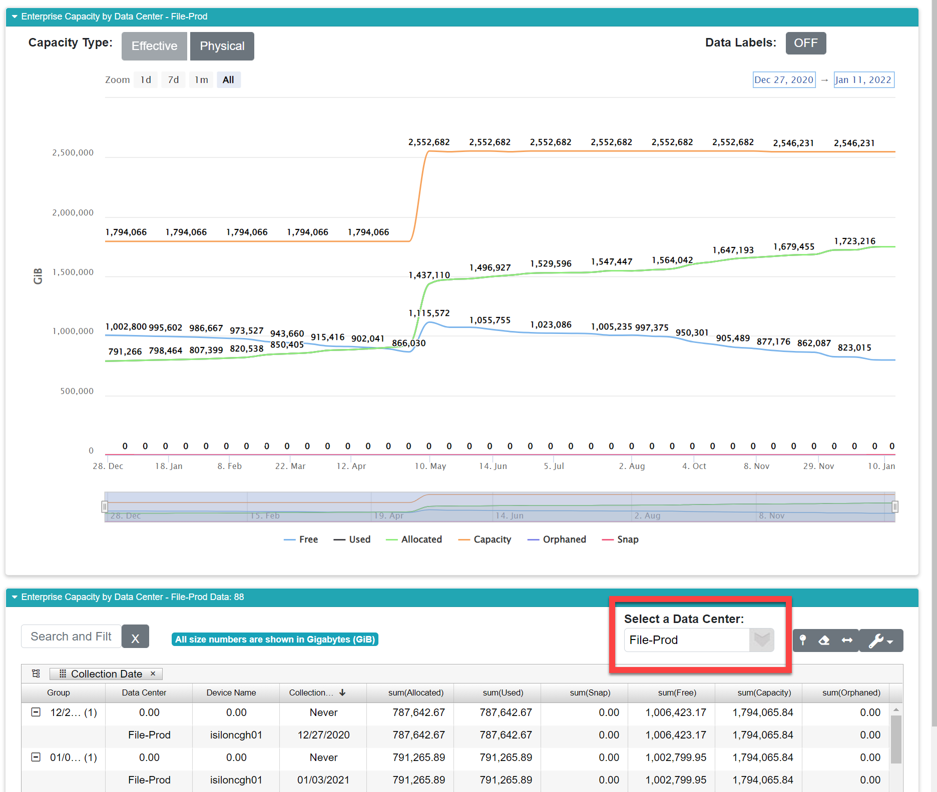
Changing the data center will alter the data displayed in the customizable data grid, and in turn, the data displayed in the line graphs above the grid.
Capacity by Device Type Trend
This is a variant of the Enterprise Capacity Trend report. All the explanations for the graphs offered in the documentation of that report hold true for this one as well. The difference is this one is broken down by device type. The customizable data grid shows a selector for picking the device type you’d like to see. By default, it is set to the first device type in the list.
You can change the device type displayed in the graph by changing the selection in the drop-down list labelled Select Device.
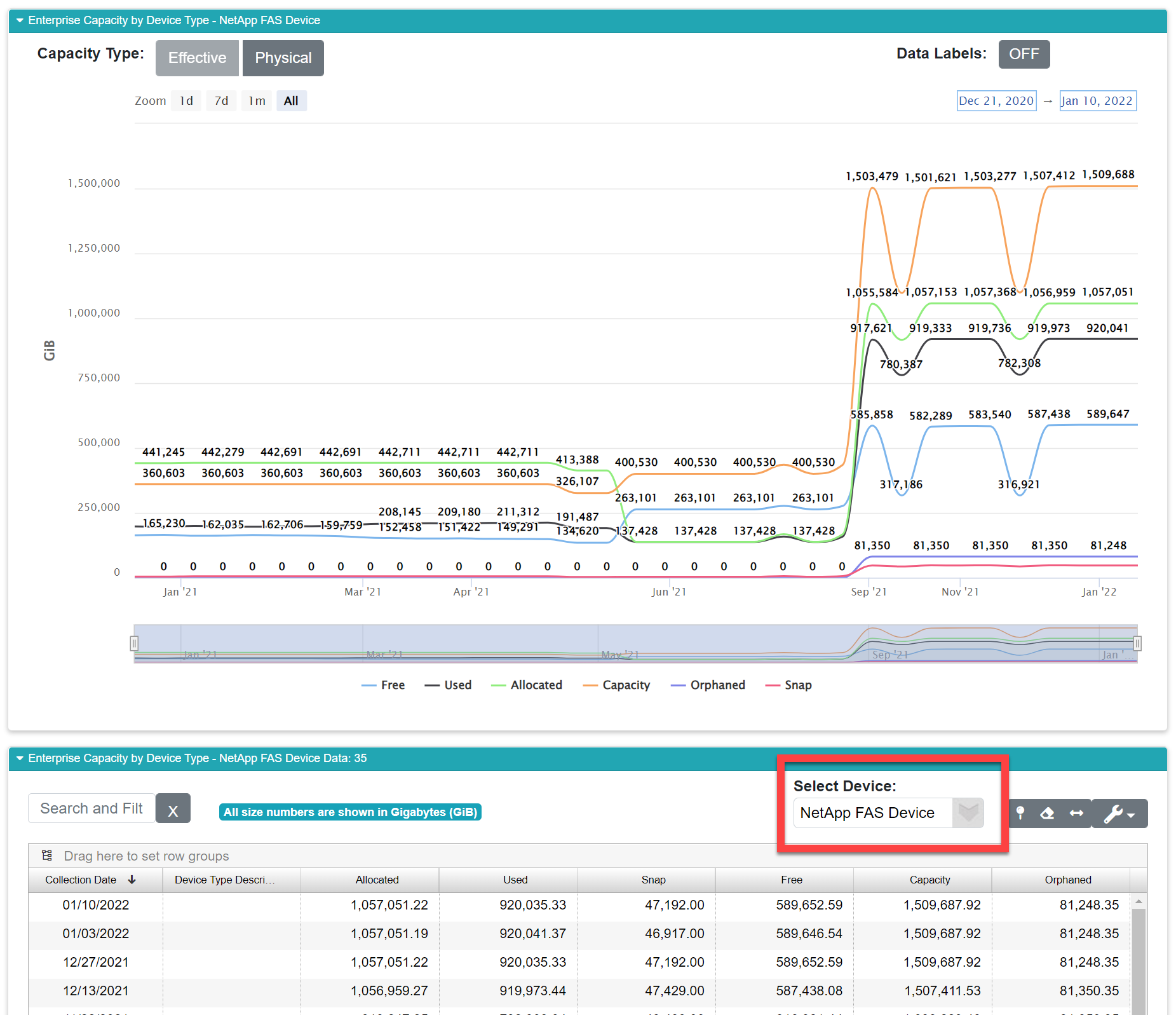
Changing the device type will alter the data displayed in the customizable data grid, and in turn, the data displayed in the line graphs above the grid.
Capacity by Classification
Trend
This is a variant of the Enterprise Capacity Trend report. All the explanations for the graphs offered in the documentation of that report hold true for this one as well. The difference is this one is broken down by classification. Classifications are set up when your organization is on-boarded with VSI. They allow you classify the different ways your organization uses storage. For example, you might have a classification for Backup storage, another for file share storage, and another for tracking your major applications like Oracle or SAP. This report allows you to review how storage is used across those classifications. The customizable data grid shows a selector for picking the device type you’d like to see. By default, it is set to the first device type in the list.
You can change the classification displayed in the graph by changing the selection in the drop-down list labelled Select Classification.
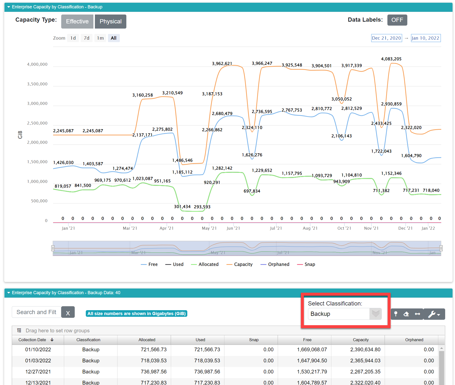
Changing the classification will alter the data displayed in the customizable data grid, and in turn, the data displayed in the line graphs above the grid.
Capacity All Data Centers
Trend
This is a variant of the Enterprise Capacity Trend report. All the explanations for the graphs offered in the documentation of that report hold true for this one as well. The difference is this one is broken down by device type. The customizable data grid shows a selector for picking the device type you’d like to see. By default, it is set to the first device type in the list.
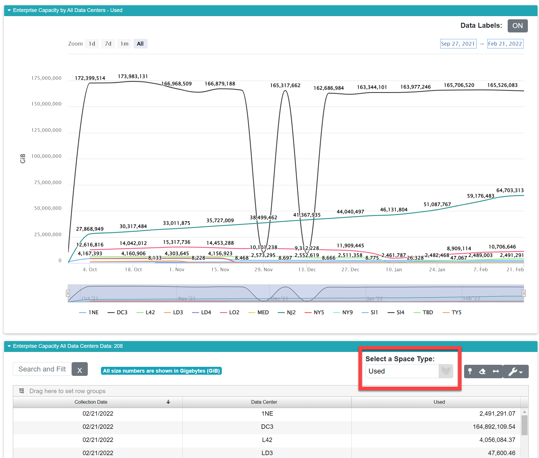
You can change the device type displayed in the graph by changing the selection in the drop-down list labelled Select Data Center.
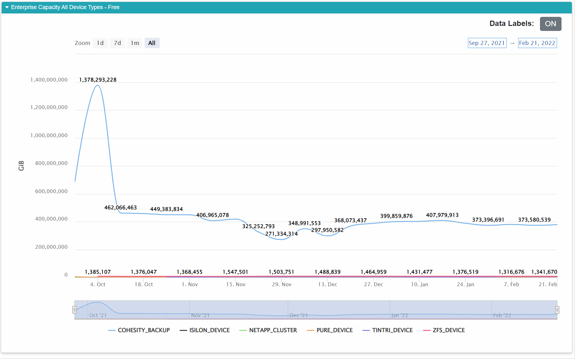
Capacity All Device Types
Trend
This report shows you a trend line for each data center within your global IT environment. You can change the metric you are viewing to any of the following:
Used
Free
Percent Used
Physical Used
Physical Free
Allocated
Capacity
Physical Capacity
Orphaned
Snap
When you pick one of these metrics, you see that metric graphed over time for each data center. For example, if you want to see how your percentage of used space is changing over time for each data center, this report shows that. To change the metric, select it from the drop-down labelled Select a Space Type above the customizable data grid.
If you have a high capacity device type, it can sometimes dwarf the rest of the results making them un-readable. When that happens, turn off the offending device in the graph controls. For example, below we see an enterprise six device types, but the COHESITY_BACKUP device is significantly larger in terms of capacity and utilization than all the rest, so you can’t see the trends on the other devices. Turning off COHESITY_BACKUP using the line graph controls let’s us see the real trend on the other device types.
Capacity All
Classifications Trend
This report works the same way Capacity All Data Centers works. You have the same ten metrics:
Used
Free
Percent Used
Physical Used
Physical Free
Allocated
Capacity
Physical Capacity
Orphaned
Snap
This time instead of showing you data centers, we’re showing you the trend for the selected metric by classification within your enterprise.
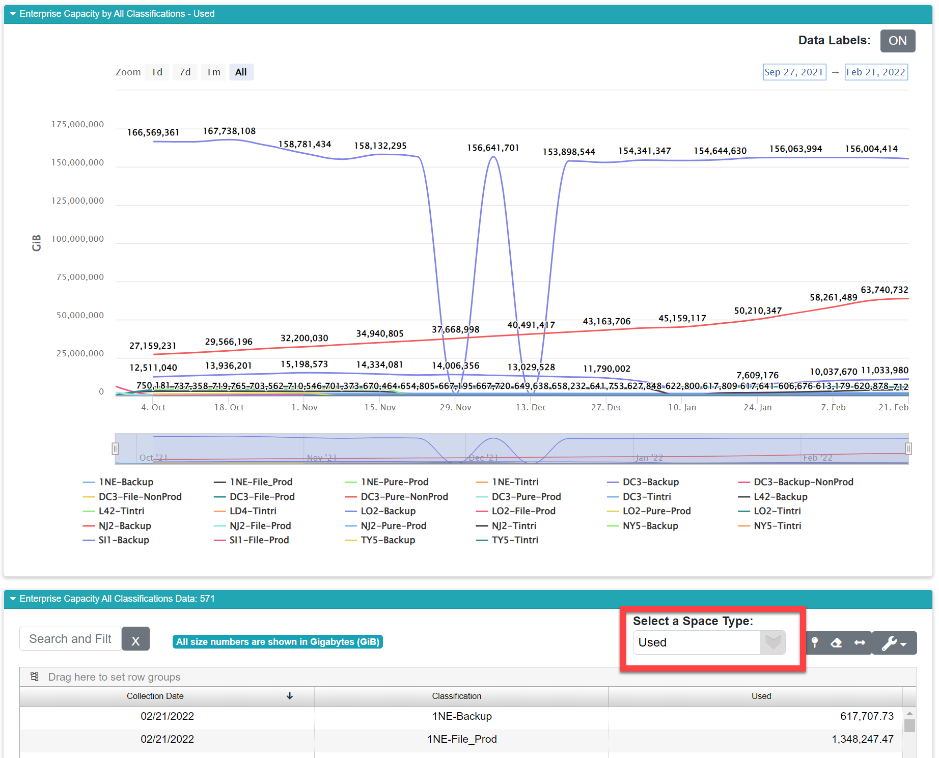
As with the other reports, you can change the metric viewed for the report using the drop-down selector labelled Select a Space Type. This particular graph, like Capacity All Device Types Trend, shows a large skew in the data. The devices used for backup are significantly bigger in terms of capacity and utilization so their lines dwarf the other systems. You can turn those lines off by clicking the elements in the legend (see above for a visual example of this).
Performance Trend Reports
Most of the second half of the Enterprise Storage Trends menu focuses on performance. Many of these reports have a lot in common with each other, so let’s first look at some commonalities.
Each trend report is designed to show you two sets of data taken from two important sources. You’ll notice each chart has two Y axes. The positioning and color for these charts is intentionally the same on all our reports. The blue lines represent Input Output Operations Per Second (IOPS) which is measured as a count. We’re counting the number of operations that happen every second. The solid line represents your overall statistics for performance across your enterprise. The dashed line represents the same statistic, but focuses on your tier 1, your fastest storage. We would always expect the dashed line to be well below the solid line for the same metric. The corresponding Y axis is on the 👈 left side and is labelled IOPS. Again, IOPS is a count, so you are looking for numbers here in the hundreds of thousands.
The second set of lines in green represent the other measure for performance, your system’s latency. Latency is the average time it takes for an I/O request to complete. These statistics are graphed with green lines. As with IOPS, the solid line represents your overall latency and the dashed line surfaces your tier 1 performance. The Y axis for this set of statistics is on the right side 👉 , and its labelled using a measure of time in milliseconds.
A lot of popular critiques of data-heavy applications decry the use of multi-axis charting claiming that it’s too difficult to read and distinguish between the lines and their corresponding axis. While taking that into consideration, it is actually vital that we use the two axes on the same graph when presenting performance. It is virtually meaningless to report the IOPS statistics by themselves. Latency is the most important measure of performance for your storage system because without an understanding for how long each operation takes to complete you don’t have a full picture of your real performance. For example, if we tell you your array averages 10,000 IOPS, that by itself doesn’t tell you anything useful. If we tell you your array averages 10,000 IOPS with an average latency of 50 ms, that means your performance is really bad and adjustments likely are needed. If we target 10 ms for our internal performance requirements, the same device is really only capable of 2,000 IOPS. The end-users of your systems care about how fast their applications are operating. This is measured as latency. In a perfect world, your green latency lines should be near zero. If they are, it matters little what the IOPS number is. Your storage is fast and your users are happy.
Bear in mind as you review these reports that your latency is the more important statistic between the two, but both are needed to tell the whole performance story.
Users living with color blindness may have trouble with the colors on some of these graphs since given they depict the statistics in green and blue. If this is you, remember you can turn the lines on and off individually by clicking the lines in the graph’s legend. We have plans in the next major release to provide more support for these users in the next major release of VSI.
Enterprise Performance Trend
This report focuses on your overall performance throughout your storage enterprise. See the above description regarding the meaning of the fields in the graph.
The customizable data grid beneath the graph shows the raw data used for the graphs illuminating the trend using the following fields:
Field |
What It Means |
How It’s Computed |
|---|---|---|
Collection Date |
The date the data were collected |
Captured automatically when we run data collection |
IOPS |
Input / Output Operations Per Second (IOPS) is a performance measure that focuses on the counted number of operations that can be completed within one second. |
Your devices report this statistic directly during data collection. VSI uses a weighted average for summarizing your data on this graph. |
Tier 1 IOPS |
This refers to the IOPS (see above) statistics with a focus on tier 1 storage, which is your fastest storage used for your mission critical and most demanding workloads. |
Your devices report this statistic directly during data collection. VSI uses a weighted average for summarizing your data on this graph. |
Latency |
Latency measure the time it takes to complete a single I/O operation. |
Your devices report this statistic directly during data collection. VSI uses a weighted average for summarizing your data on this graph. |
Tier 1 Latency |
This refers to the latency statistics with a focus on your tier 1 storage, which is your fastest storage used for your mission critical and most demanding workloads. |
Your devices report this statistic directly during data collection. VSI uses a weighted average for summarizing your data on this graph. |
Performance by Data Center
Trend
This report focuses on your overall performance throughout your storage enterprise. See the above description regarding the general meaning of the fields in the graph. This one doesn’t report your tier 1 performance separately, so you won’t see dashed lines on this graph. The IOPS reported here are peak IOPS rather than average which is to say we average the performance peaks in your data rather than presenting a weighted average of each device's own average.
This report groups and reports the averages by your organization’s data centers, and it focuses on a single data center at a time allowing you to see the uncluttered trend detail for that data center by itself. You can change the data center displayed using the selector labelled Select a Data Center just above the customizable data grid. Further down the menu, we have a report that shows all these together in one report if you’re interested in a side-by-side comparison.
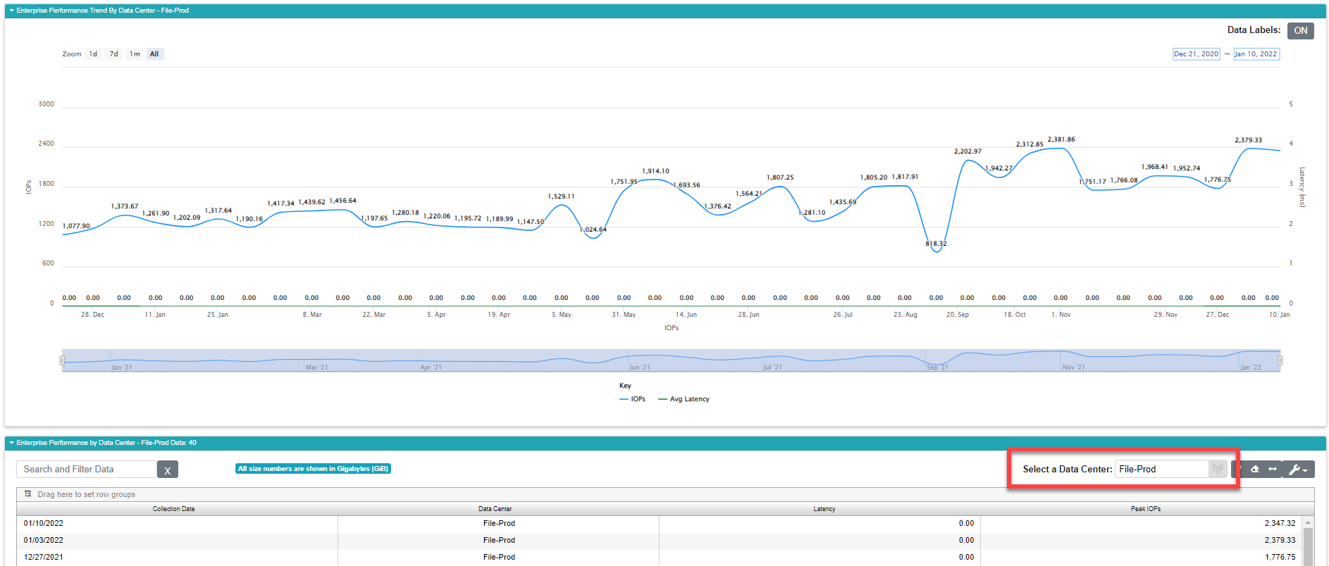
The customizable data grid beneath the graph shows the raw data used for the graphs illuminating the trend using the following fields:
Field |
What It Means |
How It’s Computed |
|---|---|---|
Collection Date |
The date the data were collected |
Captured automatically when we run data collection |
Data Center |
The data center under review |
You select this (see above) |
Latency |
Latency measure the time it takes to complete a single I/O operation. |
Your devices report this statistic directly during data collection. VSI uses a weighted average for summarizing your data on this graph. |
Peak IOPs |
Input / Output Operations Per Second (IOPS) is a performance measure that focuses on the counted number of operations that can be completed within one second. In this case we’re focused on Peak IOPS which represents the usual IOPS statistic while the array is under load. |
Your devices report this statistic directly during data collection. VSI uses a weighted average for summarizing your data on this graph. |
Performance by Device Type
Trend
This report allows you to focus analysis of performance to a single device type. Use it to find out how well your NetApp, IBM, EMC, or whatever individual device type your interested in is performing. Further down the menu, we have a report that shows all these together in one report if you’re interested in a side-by-side comparison. You can change the device type using the selector labelled Select Device located just above the customizable data grid.
The fields within the data grid are:
Field |
What It Means |
How It’s Computed |
|---|---|---|
Collection Date |
The date the data were collected |
Captured automatically when we run data collection |
Device Type Description |
Shows the device type under consideration |
You select this (see above) |
Latency |
Latency measure the time it takes to complete a single I/O operation. |
Your devices report this statistic directly during data collection. VSI uses a weighted average for summarizing your data on this graph. |
Peak IOPs |
Input / Output Operations Per Second (IOPS) is a performance measure that focuses on the counted number of operations that can be completed within one second. In this case we’re focused on Peak IOPS which represents the usual IOPS statistic while the array is under load. |
Your devices report this statistic directly during data collection. VSI uses a weighted average for summarizing your data on this graph. |
Performance by
Classification Trend
This report allows you to focus your performance analysis on a particular classification of devices. This allows you to review the performance by some classification like “block storage” or “file storage”. The classifications are defined in your organization’s business unit data.
You can change the classification under review using the selector labelled Select Classification just above the customizable data grid.
The fields within the data grid are:
Field |
What It Means |
How It’s Computed |
|---|---|---|
Collection Date |
The date the data were collected |
Captured automatically when we run data collection |
Classification |
Shows the classification under consideration |
You select this (see above) |
Latency |
Latency measure the time it takes to complete a single I/O operation. |
Your devices report this statistic directly during data collection. VSI uses a weighted average for summarizing your data on this graph. |
Peak IOPs |
Input / Output Operations Per Second (IOPS) is a performance measure that focuses on the counted number of operations that can be completed within one second. In this case we’re focused on Peak IOPS which represents the usual IOPS statistic while the array is under load. |
Your devices report this statistic directly during data collection. VSI uses a weighted average for summarizing your data on this graph. |
The ALL Performance Reports
The reports in this section break away from the conventions used so far. Lovingly referred to as “The All Performance Reports”, these next few on the menu are designed to focus on the big picture versus the last set that focused on individual grouping metrics. So it’s nice to see performance by data center, but it might be equally or more useful to see all your data centers, or all your device types graphed together. In these reports instead of selecting a grouping category like data center, device type, classification, etc. you instead pick the performance metric allowing you to switch between IOPS, Latency measured in milliseconds, and a new (or at least different) metric Megabytes Per Second (MB/s) which is a measure of overall throughput. Like latency it is a measure of performance related to time, but MB/Sec is often a more practical metric since it focuses on how much actual data is moving to and from the device rather than focusing on the average timing of a single request.
To adjust which statistics you’re reviewing, use the selector above the customizable data grid. Each report will present it in the same place:
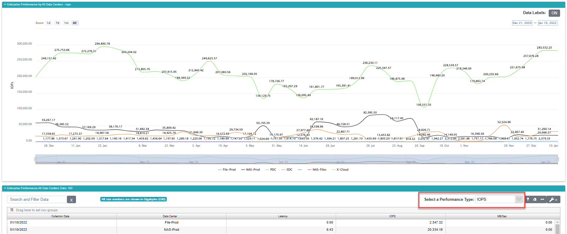
Remember for these reports we’re not showing both axes, we’re only showing one which you can pick using the selector. IOPS shows up first alphabetically, but you need to check your latency as well as your IOPS numbers. Furthermore, the colors are essentially random on this graph, since they represent organizationally specific data, so focus on the legend at the bottom.
Performance All Data
Centers Trend
This report shows all your data center status in a side-by-side comparison. This will help you identify any data centers that are underperforming relative to your organization’s performance standards. Your data centers are listed in the legend beneath the the graph. There is one line per data center and they are presented in an essentially random color scheme. In the reports earlier that focused on these measures one at a time, for example one data center at a time, the colors had specific meanings, here they don’t.
The fields in the data grid are:
Field |
What It Means |
How It’s Computed |
|---|---|---|
Collection Date |
The date the data were collected |
Captured automatically when we run data collection |
Data Center |
Shows the data center for that line of data |
This is defined within your organization’s business unit data |
Latency |
Latency measure the time it takes to complete a single I/O operation. |
Your devices report this statistic directly during data collection. VSI uses a weighted average for summarizing your data on this graph. |
IOPs |
Input / Output Operations Per Second (IOPS) is a performance measure that focuses on the counted number of operations that can be completed within one second. |
Your devices report this statistic directly during data collection. VSI uses a weighted average for summarizing your data on this graph. |
MB/Sec |
This is a measure of throughput. |
Your devices report this statistic directly during data collection. VSI uses a weighted average for summarizing your data on this graph. |
Remember, the colors here are random. If you see a bunch of red lines it doesn’t necessarily indicate a problem.
Performance All Device
Types Trend
This report allows you to do a side-by-side comparison of your performance based on your device types. This helps you find your fastest arrays by type, and it can help you identify underperforming storage based on those types. For example, we would expect a Pure Storage array consisting of entirely flash storage to consistently outperform a legacy NetApp FAS device which is running 10K SAS drives. If you were to see a flash system with a line closer to a traditionally slower system’s line, you know something is wrong.
Like all of the “All” performance reports, the first set of statistics you see are IOPS. You can switch the Latency and MB/Sec using the selector above the data grid (see above).
Field |
What It Means |
How It’s Computed |
|---|---|---|
Collection Date |
The date the data were collected |
Captured automatically when we run data collection |
Device Type |
Lists the device type for that line of data |
Captured automatically when we run data collection |
Latency |
Latency measure the time it takes to complete a single I/O operation. |
Your devices report this statistic directly during data collection. VSI uses a weighted average for summarizing your data on this graph. |
IOPs |
Input / Output Operations Per Second (IOPS) is a performance measure that focuses on the counted number of operations that can be completed within one second. |
Your devices report this statistic directly during data collection. VSI uses a weighted average for summarizing your data on this graph. |
MB/Sec |
This is a measure of throughput. |
Your devices report this statistic directly during data collection. VSI uses a weighted average for summarizing your data on this graph. |
Remember, the colors here are random. If you see a bunch of red lines it doesn’t necessarily indicate a problem.
Performance All
Classifications Trend
This report shows you a side-by-side comparison by classifications. This will allow you to review how well your various classes of storage are performing relative to one another. For example you’ll be able to see how your block storage performs in comparison to your file storage. These classes typically have different performance characteristics, so you’re looking for unlikely convergences.
The fields in the grid are the raw data used for the graph:
Field |
What It Means |
How It’s Computed |
|---|---|---|
Collection Date |
The date the data were collected |
Captured automatically when we run data collection |
Classification |
Shows the storage classification for that line of data |
This is defined within your organization’s business unit data |
Latency |
Latency measure the time it takes to complete a single I/O operation. |
Your devices report this statistic directly during data collection. VSI uses a weighted average for summarizing your data on this graph. |
IOPs |
Input / Output Operations Per Second (IOPS) is a performance measure that focuses on the counted number of operations that can be completed within one second. |
Your devices report this statistic directly during data collection. VSI uses a weighted average for summarizing your data on this graph. |
MB/Sec |
This is a measure of throughput. |
Your devices report this statistic directly during data collection. VSI uses a weighted average for summarizing your data on this graph. |
Remember, the colors here are random. If you see a bunch of red lines it doesn’t necessarily indicate a problem.
You know that drawer everybody has in their kitchen that houses all the important stuff which doesn’t seem to belong anywhere else? Like batteries and tape. You need them, but you don’t need a battery drawer the way you need one for your flatware. Welcome to that drawer in this menu. These next two reports show vital information but don’t fit the molds presented by their predecessors.
Tier by Data Center
This report shows you a break-down of capacity based on storage tiers within each data center. You select which data center you want to view using the selector above the customizable data grid. The lines on this single axis graph represent the different tiers defined within your business unit data. Most enterprises use a three tier system with your fastest (and usually most expensive) storage belonging to tier 1. Tier 2 is your intermediate in terms of performance and cost per gigabyte, while tier 3 typically represents the slowest and cheapest storage in your inventory.
For each tier we have two lines representing used and free, so we expect to see tier 1 used and free, tier 2 used and free, and tier 3 used and free. Sometimes storage can appear in multiple tiers, and we show those as multi-tier used and free.
With that said, you have to watch out for skew on this report. The tier 3 capacity can easily dwarf the other two tiers making it appear as though you have tons of tier 3 and relatively nothing in tiers 1 and 2. While techincally accurate, your tier 1 and 2 numbers get lost in a jumble of near zero lines. To remedy this, turn off the tier 3 storage lines by clicking them in the graph’s legend.
As usual, the data grid shows us the data used to plot the graph using these fields:
Field |
What It Means |
How It’s Computed |
|---|---|---|
Collection Date |
The date the data were collected |
Captured automatically when we run data collection |
Data Center |
Shows the data center for that line of data |
This is defined within your organization’s business unit data |
Tier 1 Free |
The amount of free space on each collection date for tier 1 storage |
Your devices report this statistic directly during data collection. VSI uses a weighted average for summarizing your data on this graph. |
Tier 2 Free |
The amount of free space on each collection date for tier 2 storage |
Your devices report this statistic directly during data collection. VSI uses a weighted average for summarizing your data on this graph. |
Tier 3 Free |
The amount of free space on each collection date for tier 3 storage |
Your devices report this statistic directly during data collection. VSI uses a weighted average for summarizing your data on this graph. |
Multi-Tier Free |
The amount of free space on each collection date for storage that is defined within multiple tiers. |
|
Tier 1 Used |
The amount of used space on each collection date for tier 1 storage |
|
Tier 2 Used |
The amount of used space on each collection date for tier 2 storage |
|
Tier 3 Used |
The amount of used space on each collection date for tier 3 storage |
|
Multi-Tier Used |
The amount of used space on each collection date for storage storage that spans the tier definitions. |
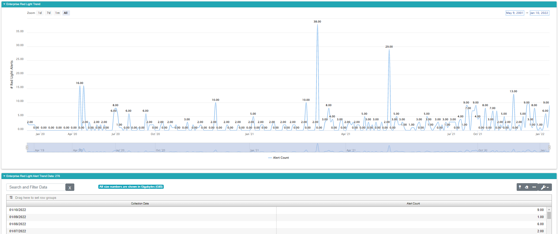
Red Light Alert Trend
With each data collection you’re getting a new set of alerts. This report shows you the trend for those alerts over time. You can often link spikes in this report to specific events like maintenance, upgrades, adding storage to an array, etc. The trends here allow you to correlate these kinds of events with spikes in the alerts so you can improve your processes in the future to account for the spikes.
The graph itself is straightforward. It shows the number of red light alerts reported by VSI on each collection date going back a maximum of 13 months. If you see a spike in this report, you can make note of the date and use the Enterprise Health reports to go back and see what the alerts were on that date.