Storage by Data Center
The Storage by Data Center report gives you a breakdown of all your data centers within your enterprise.
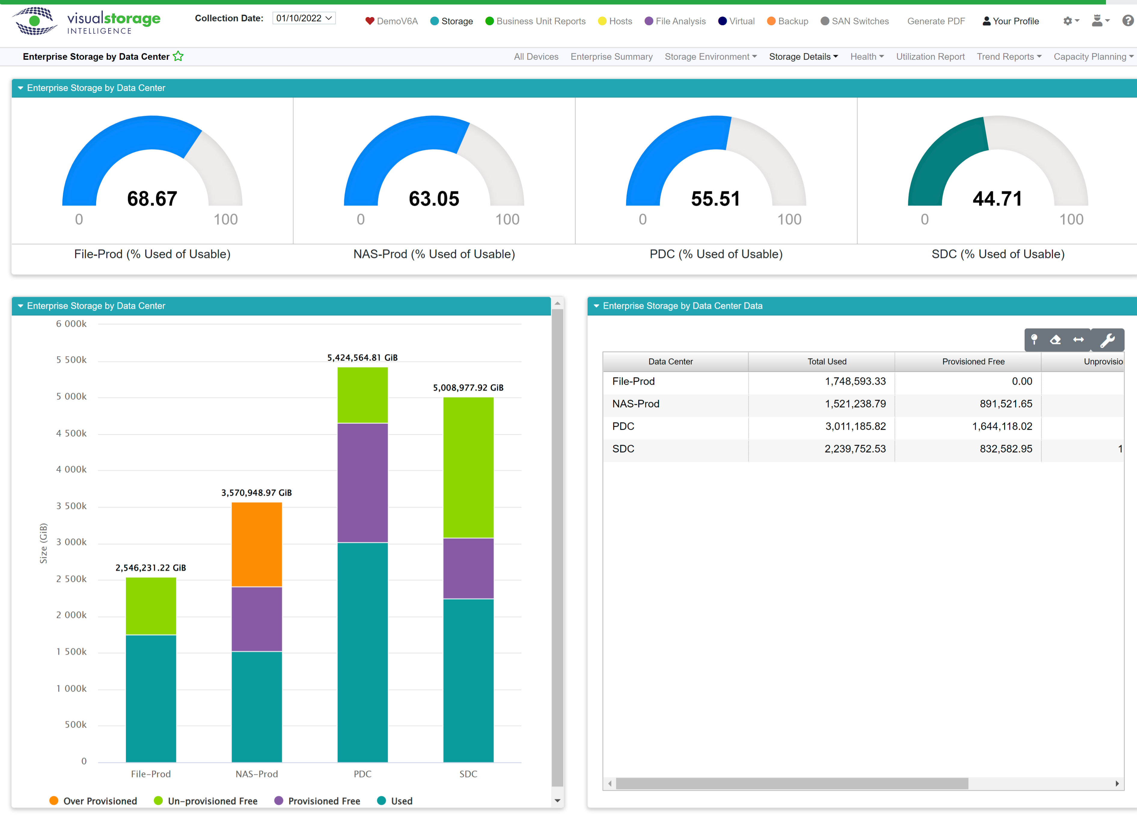
The dashboard at the top will draw one gauge for each data center. Each gauge displays the percent used of usable. To make this data easy to scan, we’ve color-coded the ranges:
Color |
Range |
|---|---|
Teal |
0-49% |
Blue |
50-69% |
Yellow |
70-79% |
Red |
80-100% |
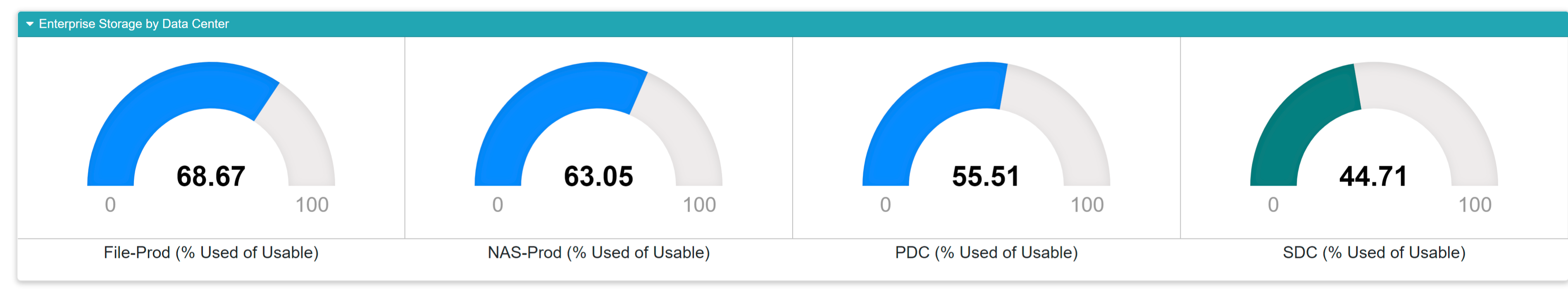
If you have a lot of data centers, you may need to scroll horizontally to see them all.
On the lower left, you’ll find a stacked bar graph showing you the breakdown of provisioned space by data center.
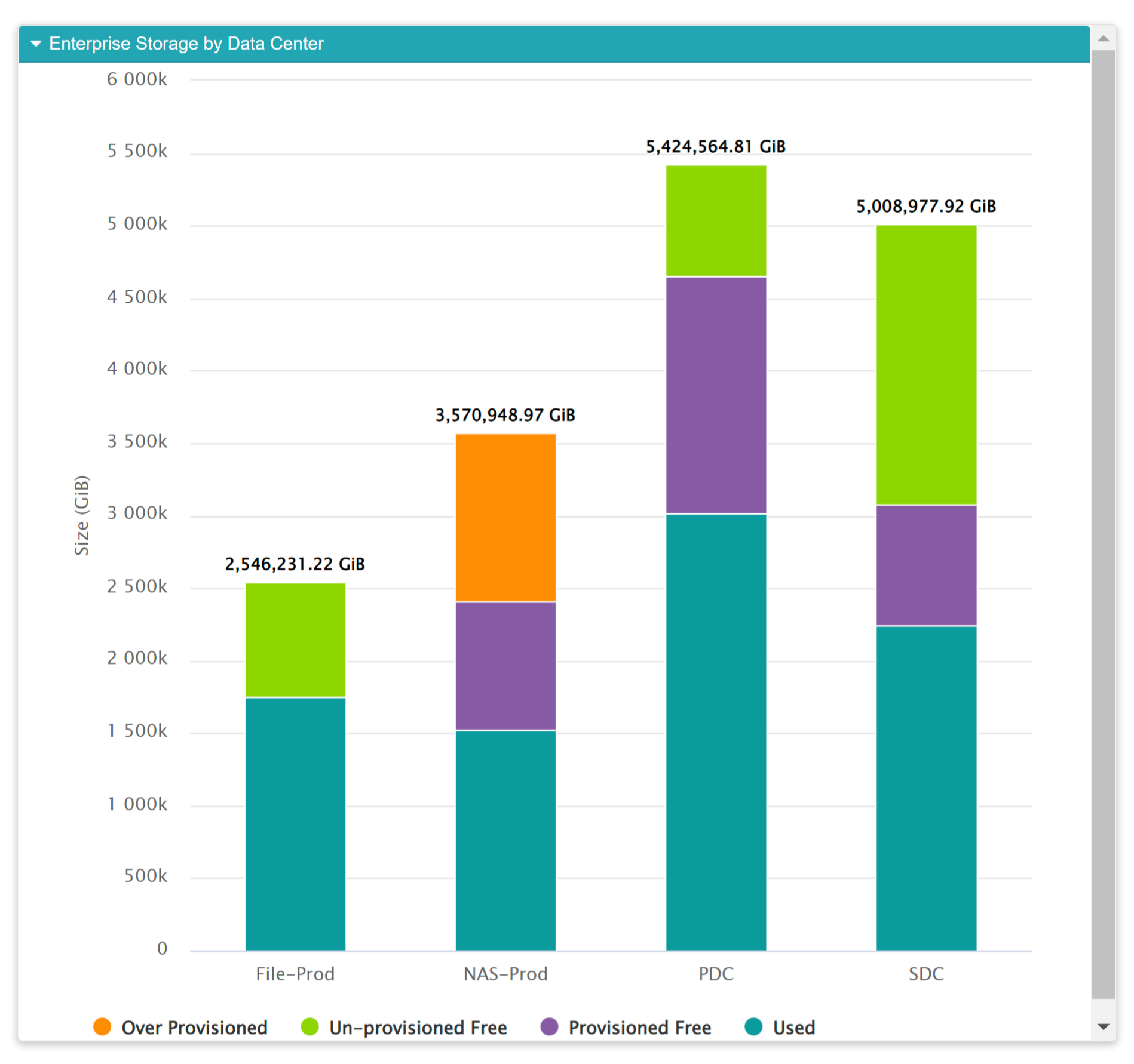
Remember, our graphs are interactive! Check out the many ways you can slice and dice the visuals in VSI by reading up on our interactive features.
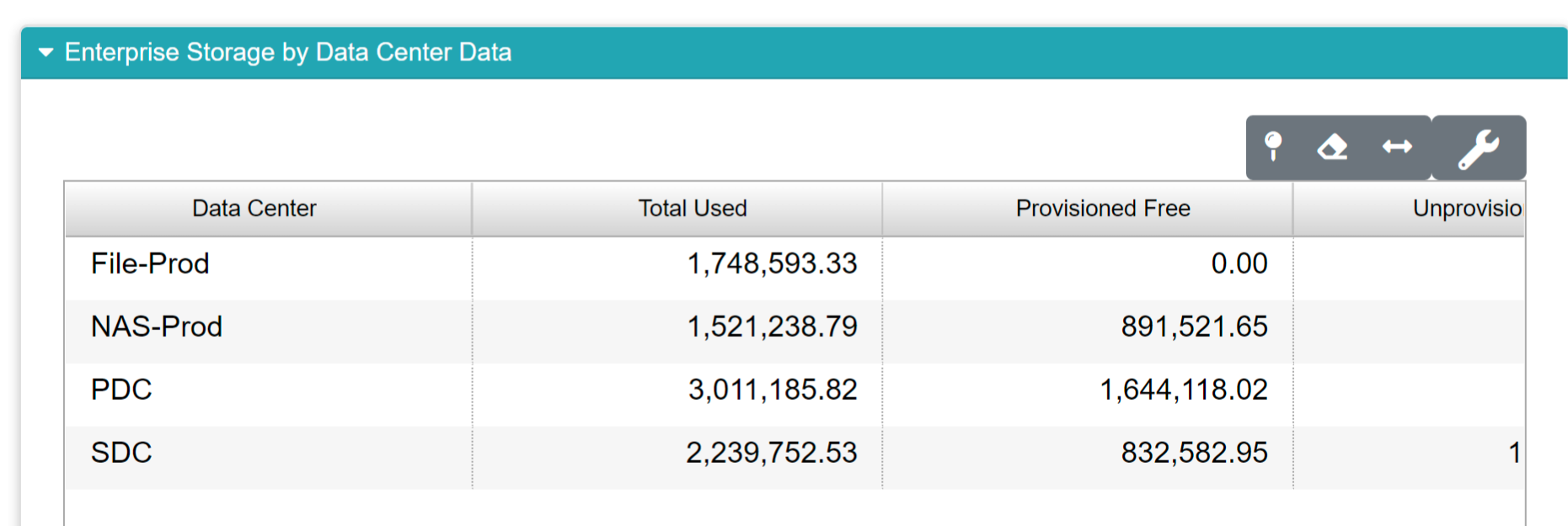
On the lower right you’ll see a table containing the statistics showing in the stacked bar chart to it’s left.
Field |
What It Means |
How Its Calculated |
|---|---|---|
Data Center |
Shows the name of the data center as it appears within your business unit data |
N/A |
Total Used |
The total amount of space currently in use |
Sum of the used space for each system within a given data center. |
Provisioned Free |
Represents the total amount of space you’ve provisioned, but that isn’t currently in use. |
Sum of the provisioned free space within a given data center. |
Unprovisioned Free |
Represents the total amount of space within the data center that hasn’t been provisioned for use. |
Sum of the unprovisioned free space within a given data center. |
Overprovisioned |
This shows the total amount of space within the data center that has been over-provisioned. Overprovisioning is a normal and acceptable practice. |
Sum of the overprovisioned space within a given data center. |
Storage by Tier
Similar to Storage by Data Center, this report shows a breakdown of storage based in your defined tiers. Tier 1 storage is typically your fast, expensive storage suitable for production workloads. Tier 2 is middle tier in performance and suitable for normal operations. Tier 3 is usually cheaper disk space used for archival storage. Tiers can be defined in your business unit data. The gauges at the top show the utilization for each tier. The stacked column graph in the lower left shows how your tiered storage is provisioned. To the lower right, the table shows the data supported the graph on the left.
The gauges at the top are color coded for easy scanning:
Color |
Range |
|---|---|
Teal |
0-49% |
Blue |
50-69% |
Yellow |
70-79% |
Red |
80-100% |
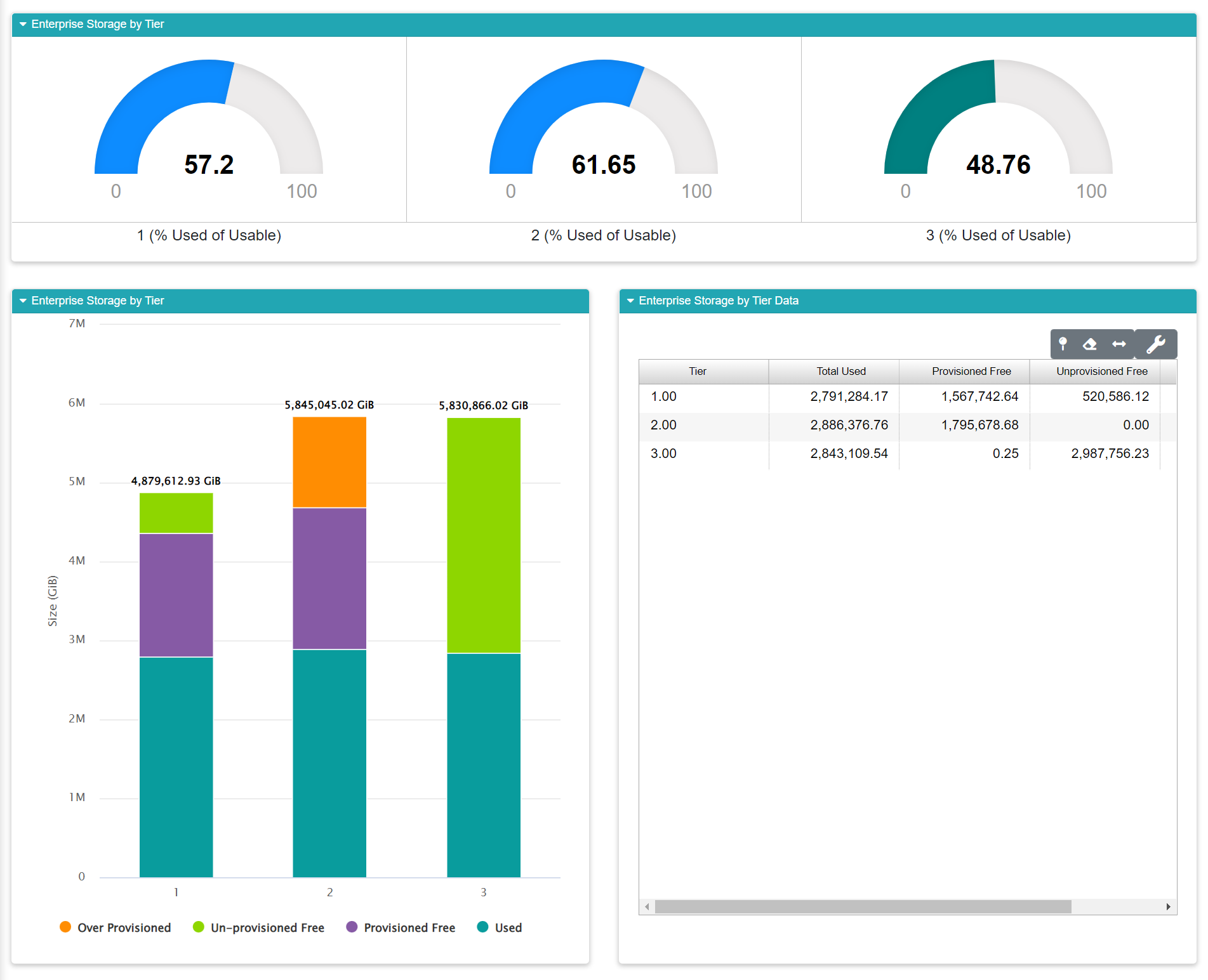
Field |
What It Means |
How Its Calculated |
|---|---|---|
Tier |
Shows a tier of storage |
Storage tiers are defined in business unit data. |
Total Used |
The total amount of space currently in use |
Sum of the used space for each system within a given data center. |
Provisioned Free |
Represents the total amount of space you’ve provisioned, but that isn’t currently in use. |
Sum of the provisioned free space within a given data center. |
Unprovisioned Free |
Represents the total amount of space within the data center that hasn’t been provisioned for use. |
Sum of the unprovisioned free space within a given data center. |
Overprovisioned |
This shows the total amount of space within the data center that has been over-provisioned. Overprovisioning is a normal and acceptable practice. |
Sum of the overprovisioned space within a given data center. |
Storage by Device Type
This report shows your storage split out by device type. The gauges at the top will show you each device type in use within your organization. If you have a heterogeneous environment you may have to scroll horizontally to see everything. As with the other “Storage by” reports, we see a stacked column graph in the lower left displaying provisioning data for each device type. The supporting data for this graph is displayed in the table at the lower right.
The gauges at the top are color coded for easy scanning:
Color |
Range |
|---|---|
Teal |
0-49% |
Blue |
50-69% |
Yellow |
70-79% |
Red |
80-100% |
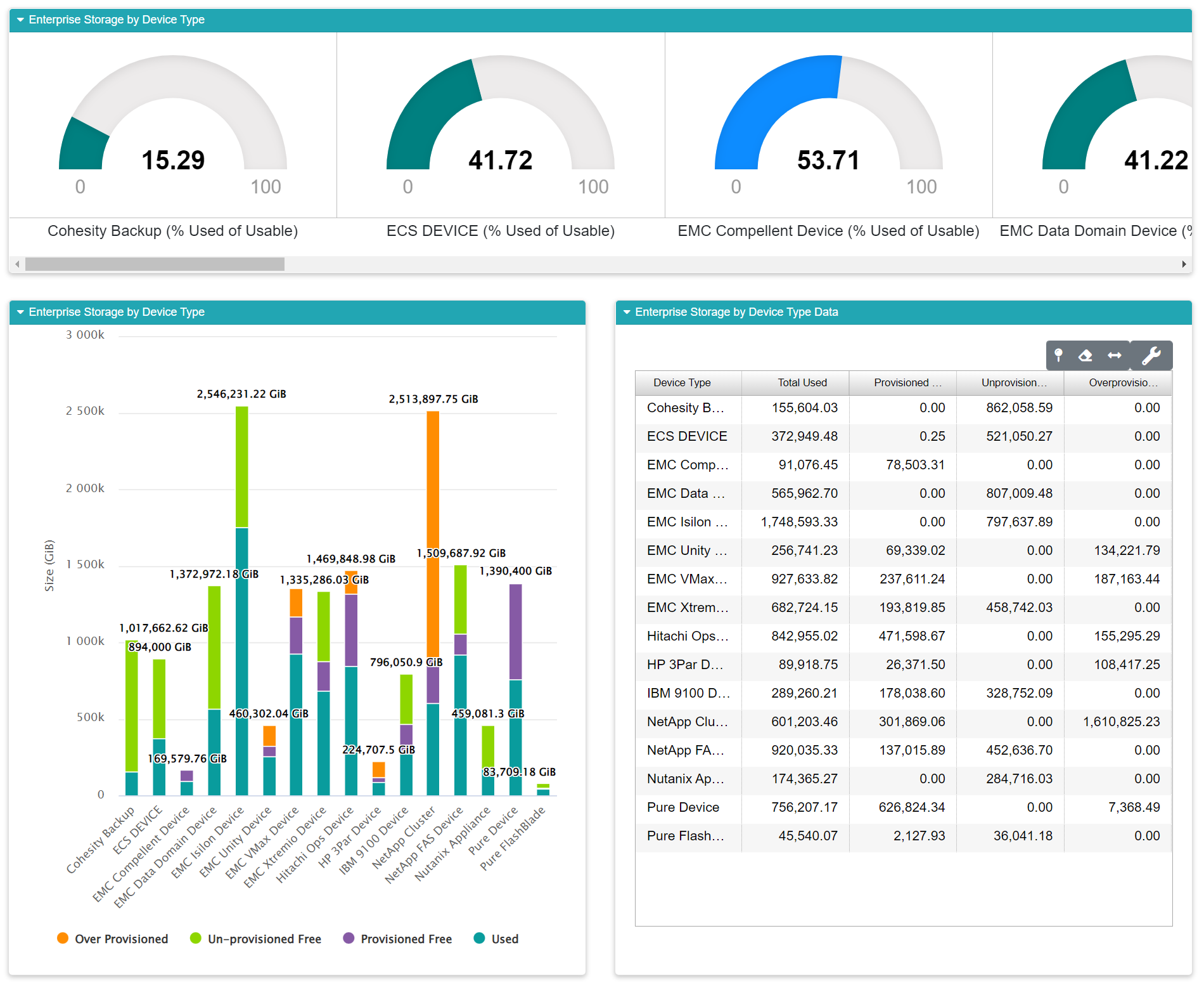
Field |
What It Means |
How Its Calculated |
|---|---|---|
Device Type |
Represents the device type each row in the report. |
Storage tiers are defined in business unit data. |
Total Used |
The total amount of space currently in use. |
Sum of the used space for each system within a given data center. |
Provisioned Free |
Represents the total amount of space you’ve provisioned, but that isn’t currently in use. |
Sum of the provisioned free space within a given data center. |
Unprovisioned Free |
Represents the total amount of space within the data center that hasn’t been provisioned for use. |
Sum of the unprovisioned free space within a given data center. |
Overprovisioned |
This shows the total amount of space within the data center that has been over-provisioned. Overprovisioning is a normal and acceptable practice. |
Sum of the overprovisioned space within a given data center. |
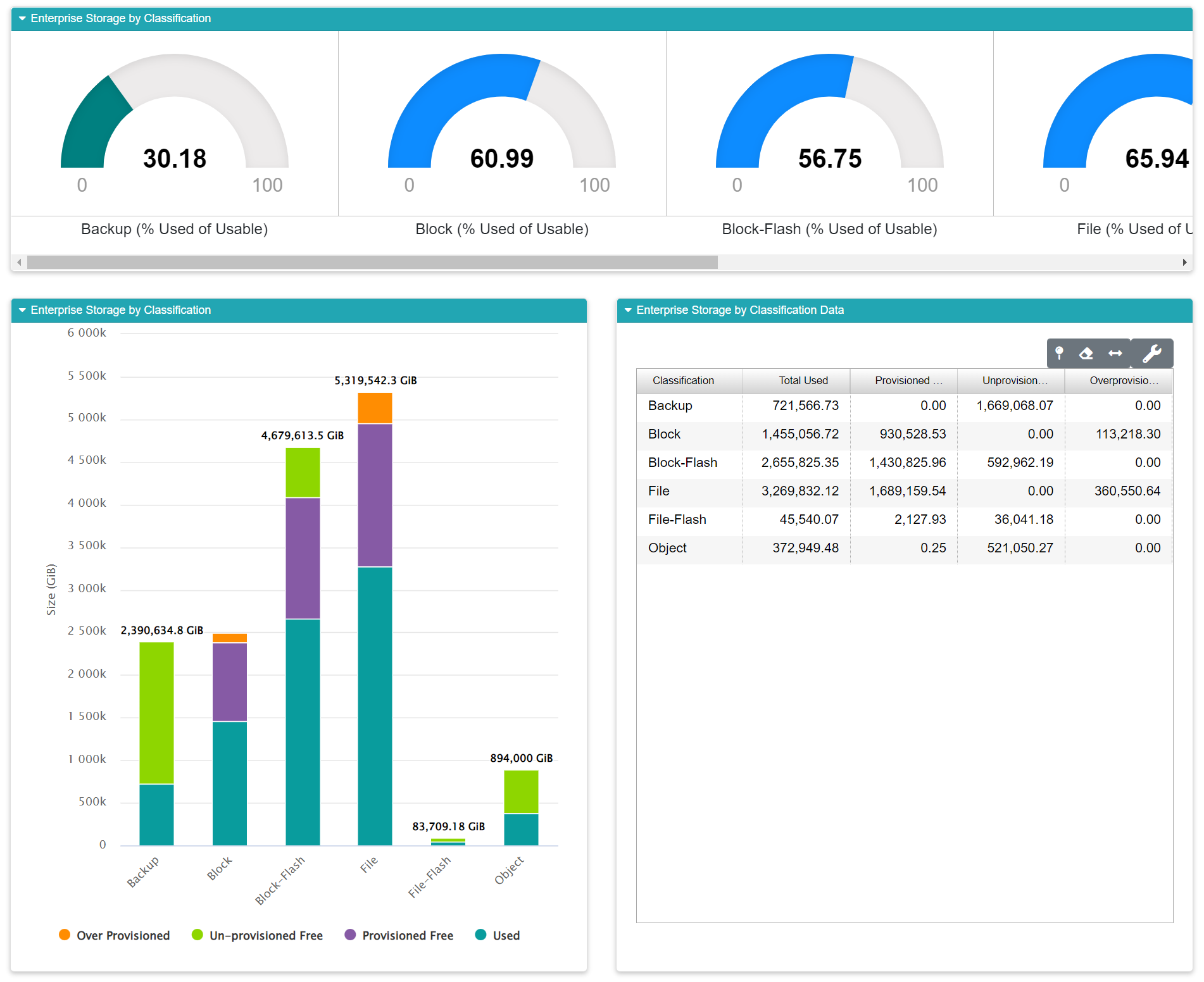
Storage by Classification
Storage by Classification shows you a breakdown of your storage based on a classification defined in your organization’s business unit settings. The gauges at the top show you utilization levels for each classification. The graph in the lower left shows how each classification is provisioned, while the supporting data for the graph appears within the table in the lower right.
The gauges at the top are color coded for easy scanning. If you have a lot of classifications, you may need to scroll horizontally to see everything.
Color |
Range |
|---|---|
Teal |
0-49% |
Blue |
50-69% |
Yellow |
70-79% |
Red |
80-100% |
Free Space by Device
This report is designed to help you find free space within the enterprise. Do you have a big project about to start? This report helps you find a place to put it. I can also show you storage fragmentation at the enterprise level. The pie chart in the top left shows you the largest amount of contiguous free space available on each array.
The column chart at upper right shows you the largest contiguous along with the overall free space for that system.
The customizable data grid at the bottom of the report shows the supporting data in tabular format. Double-click any row in the grid to view the Free Space by Disk Group Report at the device level.
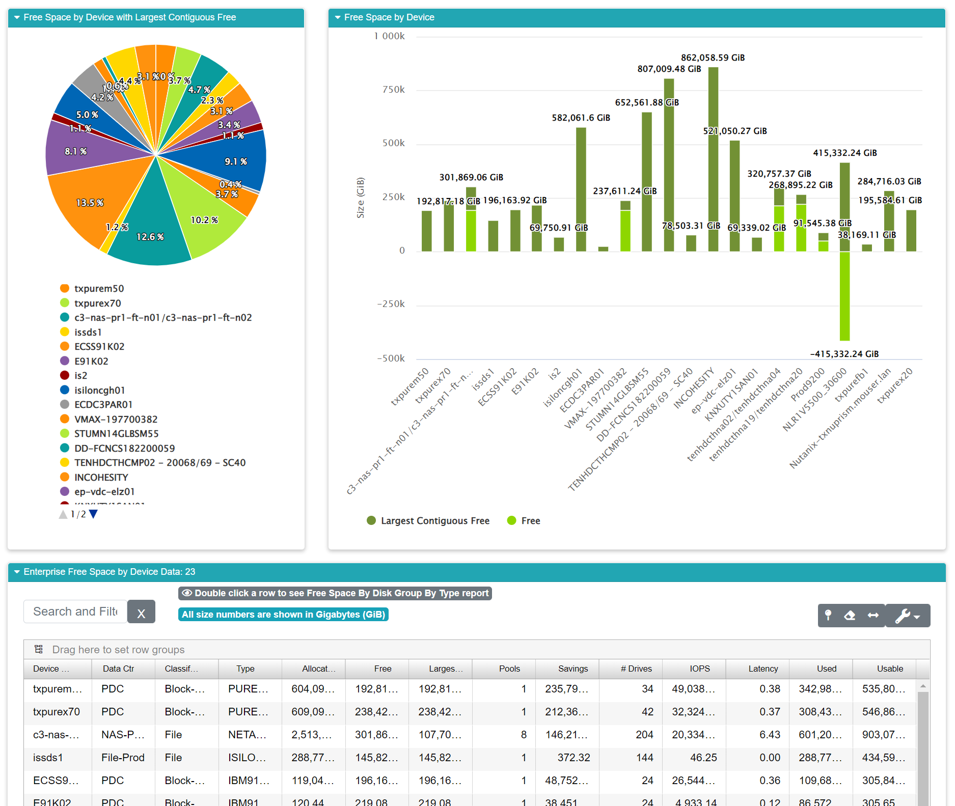
Field |
What It Means |
How Its Calculated |
|---|---|---|
Device Name |
The name of the device |
N/A |
Data Center |
The data center where the device is located. |
This is defined in your organization’s business unit data. |
Classification |
The classification for the device. |
Classifications are defined in your business unit data, usually during your company’s on-boarding process with VSI. |
Type |
The device type code |
Set by the manufacturer |
Allocated |
The amount of allocated space. |
This is reported by the device. |
Free |
The amount of free space. |
This is reported by the device. |
Largest Contiguous Free |
This is the largest section of contiguous space on the array. |
This is reported by the device |
Pools |
The number of pool hosted on the storage array. |
This is reported by the device. |
Savings |
This shows the space savings derived from the array’s built-in deduplication feature. |
This is reported by the device. |
# of Drives |
The number of drives within the array. |
This is reported by the device. |
IOPS |
Average (weighted) Input Output Operations Per Second which is one of two standard performance metrics. |
This is reported by the device. |
Latency |
Average (weighted) performance latency for the array. |
This is reported by the device. |
Used |
The total amount of used space on the array. |
This is reported by the device. |
Usable |
This is the total amount of usable space on the array. |
Raw size - overhead |
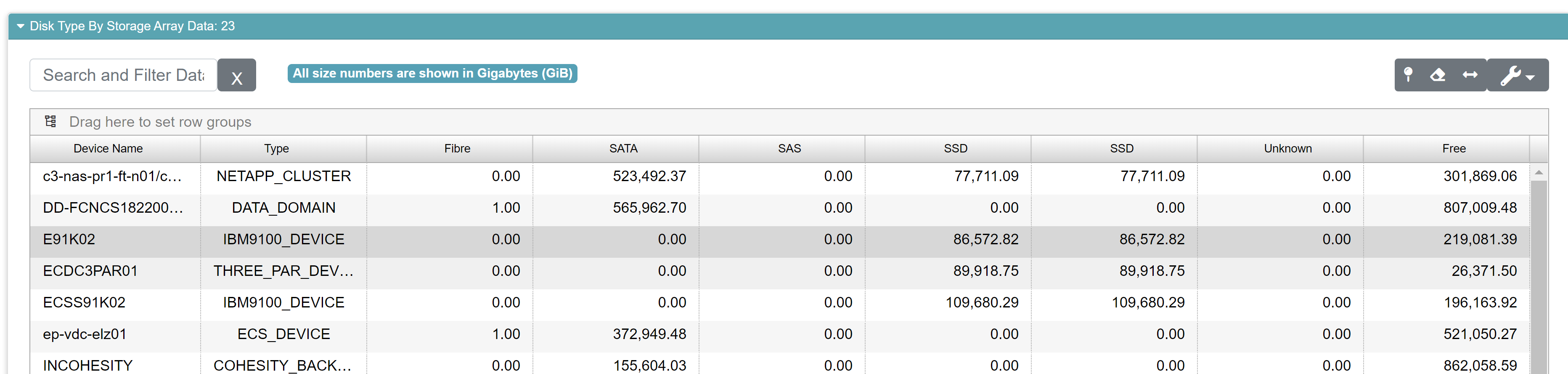
Disk Type by Storage Array
The Enterprise Disk Type by Storage Array report reflects the types of disk that are located on the storage array and graphically demonstrates the allocation of each type on the array. The top half of the report is a stacked bar graph showing your used storage on that device split out by device type. The legend at the bottom indicates the color keying for each device type. The black “unknown” type usually indicates some mixture of device types that don’t fit into a homogeneous category.
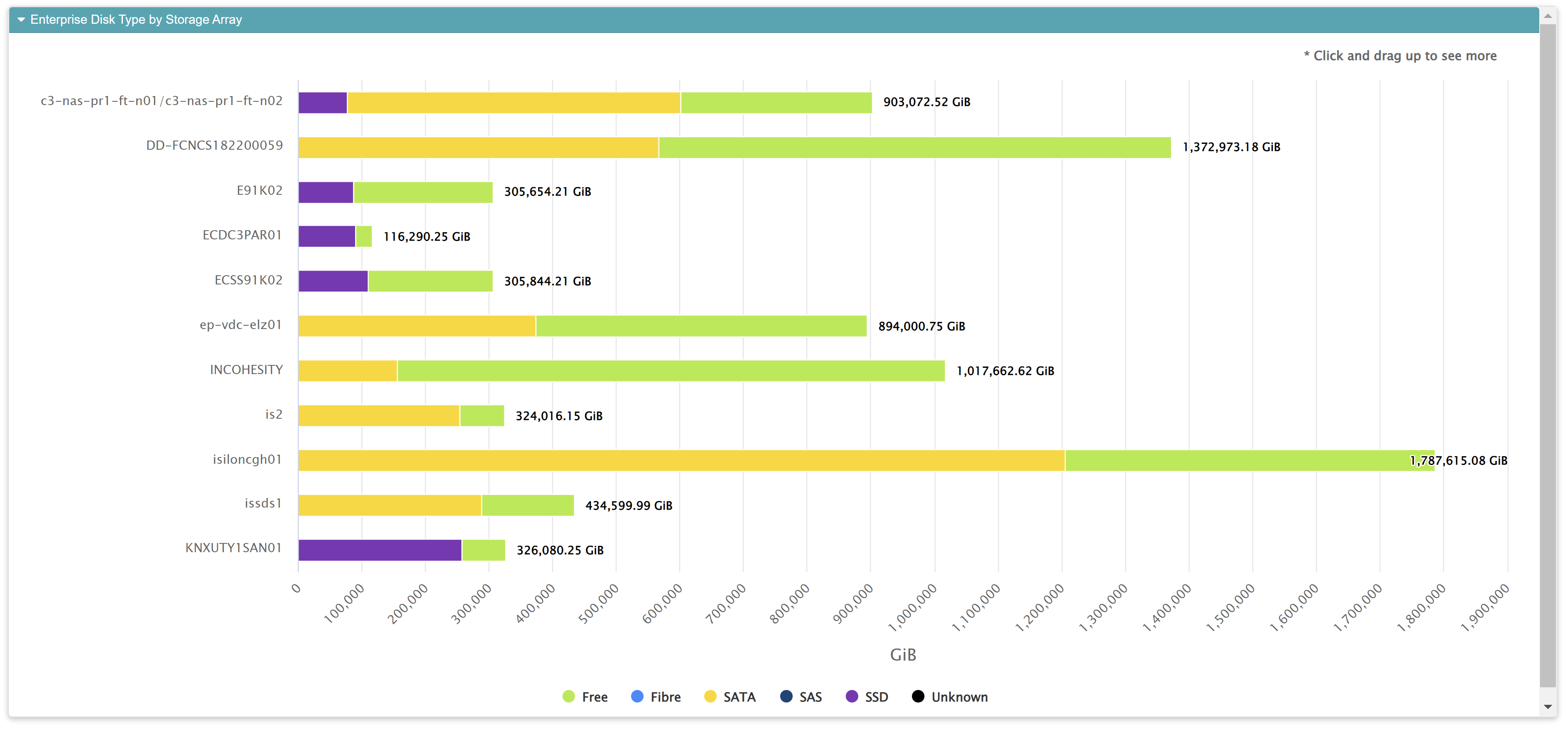
Beneath the graph is the customizable data grid that shows the supporting data for the graph.
Field Name |
What It Means |
|---|---|
Device Name |
Individual device name |
Device Type |
Name of the device hardware |
Fiber |
The size in gigabytes of Fiber on the array |
SATA |
The size in gigabytes of SATA on the array |
SAS |
The size in gigabytes of SAS on the array |
SSD |
The size in gigabytes of SSD on the array |
Unknown |
The size in gigabytes of Unknown disk types on the array |
Free |
Free space available on the array |
Snap / Replication Details
This report shows your snap space details and replication. Generally, you want these numbers to be nearly zero. The report let’s you change the data on the X-axis by switching between Classification, Device Type, and Data Center. Just click the button for what you want to see. The data grid beneath the graph shows the data used in all three aspects of the graph.
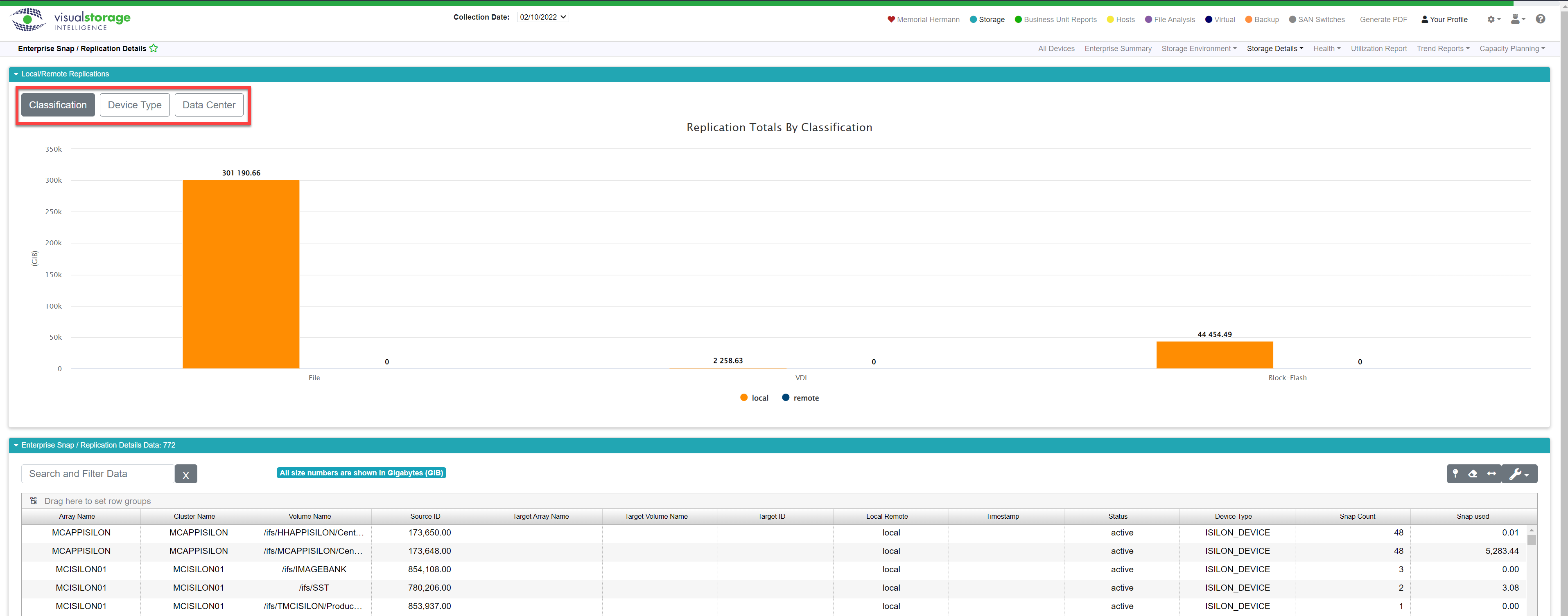
Field |
What It Means |
How It’s Calculated |
|---|---|---|
Array Name |
The name of the array with snap / replication. |
N/A |
Cluster Name |
The name of the cluster. |
N/A |
Volume Name |
The name of the volume. |
N/A |
Source ID |
||
Target Array Name |
||
Target Volume Name |
||
Local Remote |
Displays whether the array is local or remote |
|
Timestamp |
||
Status |
Shows whether the device is active. |
|
Snap Count |
This shows the total number of snapsots. |
|
Snap Used |
This shows the total space consumed by snapshots. |
Monthly Performance
Monthly Performance shows you changes in used space and IOPs for each device type in your enterprise. This report has a graph at the top showing a column chart. The used statistics are graphed in orange while the performance (IOPs) statistic is graphed in blue. This chart can show positive as well as negative changes. Your utilization and performance will ebb and tide like a financial stock price. Some months it’s up while others it’s down. This report shows you this one month at a time. We have trend reports that show you these kinds of trends over time but this report is unique in that it focuses on a single month at a time.
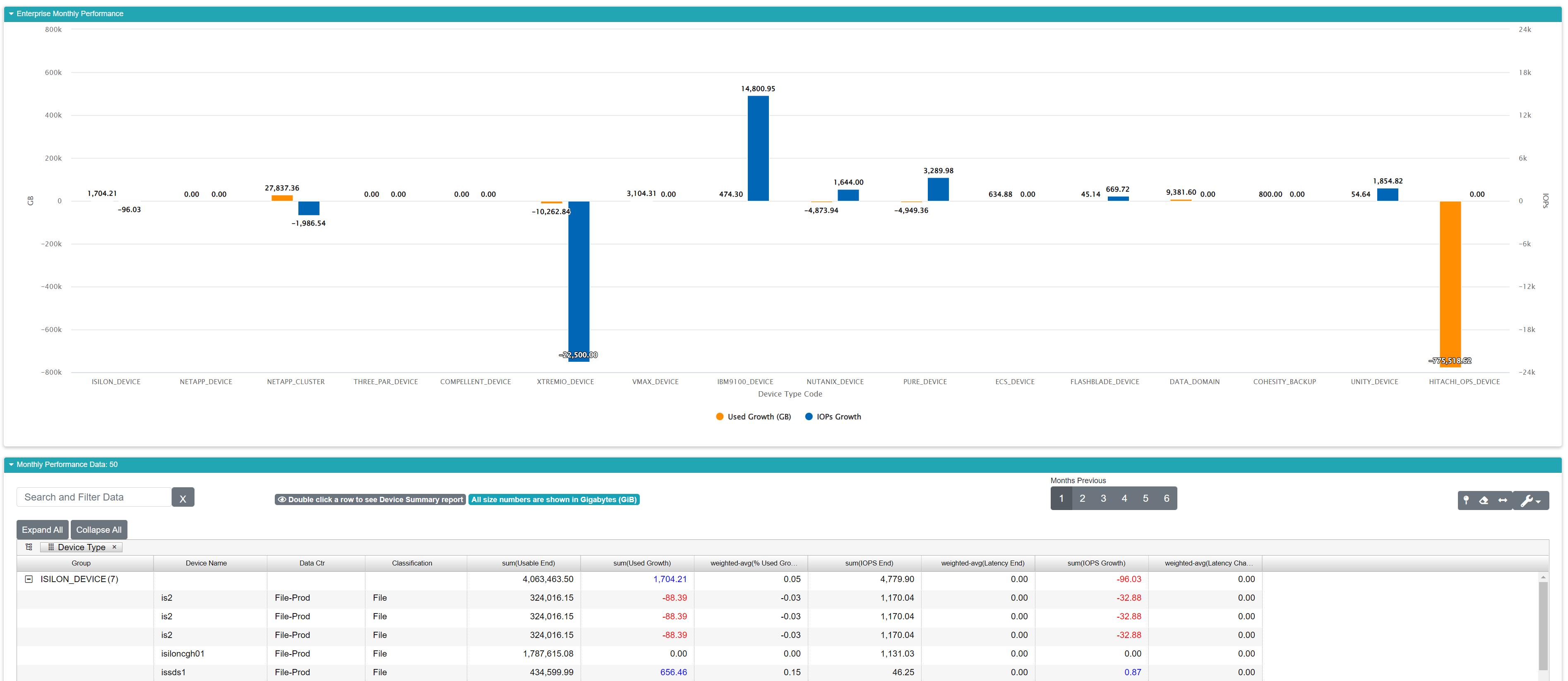
Field |
What It Means |
How Its Calculated |
|---|---|---|
Group (Device Type) |
This report comes pre-grouped by device type. |
N/A |
Device Name |
The name of the device |
N/A |
Classification |
The classification for the device. |
Classifications are defined in your organization’s business unit data. |
sum((Usable End) |
The report is pre-grouped, so this field is presenting the sum of the usable space present at the latest collection date for the month. |
We sum all the usable space within a device type at the end of the month. |
sum(Used Growth) |
The report is pre-grouped, so this field is presenting the sum of Used Growth grouped by device type. It’s telling you how much your capacity changed since last month. |
Used growth is computed by subtracting this month’s used from last month’s used. |
weighted-avg(% Used Growth) |
This field is showing you the weighted average for percentage of growth in your used space between months. It’s essentially the used growth expressed as a percentage rather than a unit of space like GiB. |
A weighted average is used to smooth out any skewing effects of any major outliers. |
sum(IOPS End) |
This grouped field is summing your IOPs at the end of the month. |
This is a sum of your IOPs by device type. |
sum(IOPs Growth) |
The sum of your IOPs growth grouped by device type. It’s telling you how much your performance changed versus last month across all devices of the device type. |
Growth is computed by subtracting the current month’s IOPs from the previous month’s. These results are summed. |
weighted-avg(Latency Change) |
The weighted average latency change since the last month. It tells you how much your performance latency rose or fell this month versus last month. |
A weighted average is used to smooth out any skewing effects of any major outliers. |
All Volumes
This report displays an exhaustive list of all volumes across all storage devices. Since it’s a large list, you can narrow it down to focus on single devices by using the Select Device drop down (outlined below in red). You can also leverage the sorting and grouping features of our customizable data grid to make the data easier to read.
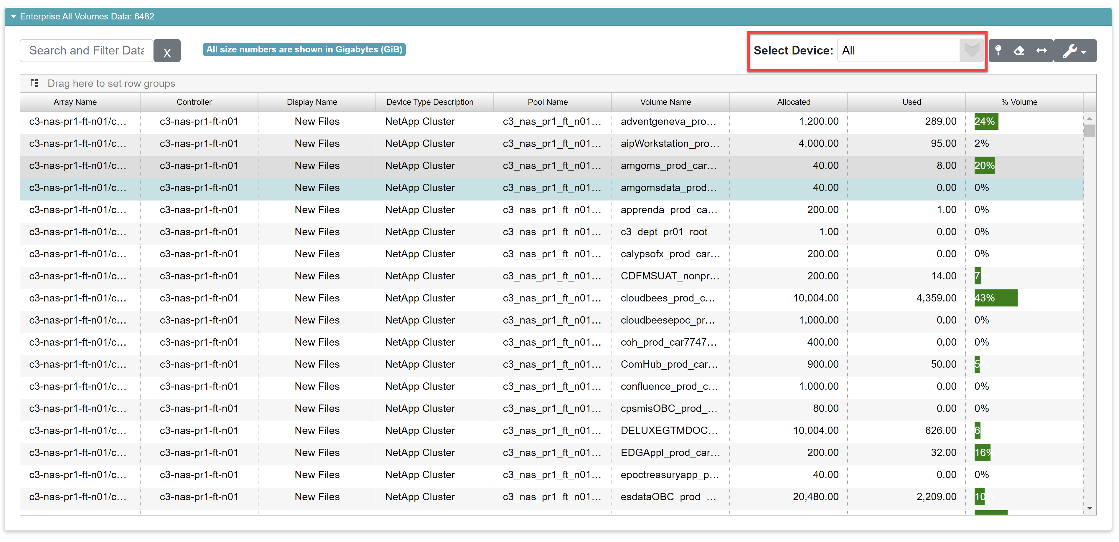
Field |
What it Means |
How Its Calculated |
|---|---|---|
Array Name |
The name of the array where the pool is hosted |
N/A |
Controller |
The controller for the array |
N/A |
Display Name |
The user-friendly name for the array. |
N/A |
Device Type Description |
Displays the device type of the array. |
N/A |
Volume Name |
The name of the volume. |
N/A |
Size |
The total size of the volume. |
This comes directly from the array |
Used |
The total used space of the volum. |
This comes directly from the array. |
% Volume |
The percentage of the used space on the volume. They’re presented as color-coded bars where green indicates you have plenty of space on the volume. Yellow indicates you’re getting close to threshold (usually around 70% full), and red indicates the volume is over threshold. Purple indicates the volume is 100% full. |
The percentage is computed by taking the volume’s used space and dividing by the size of the volume. |
All Pools
This report shows an exhaustive list of all pools within your enterprise storage infrastructure. Since it’s a large list, you can narrow it down to focus on single device by using the Select Device drop down (outlined below in red). You can also leverage the sorting and grouping features of our customizable data grid to make the data easier to read.
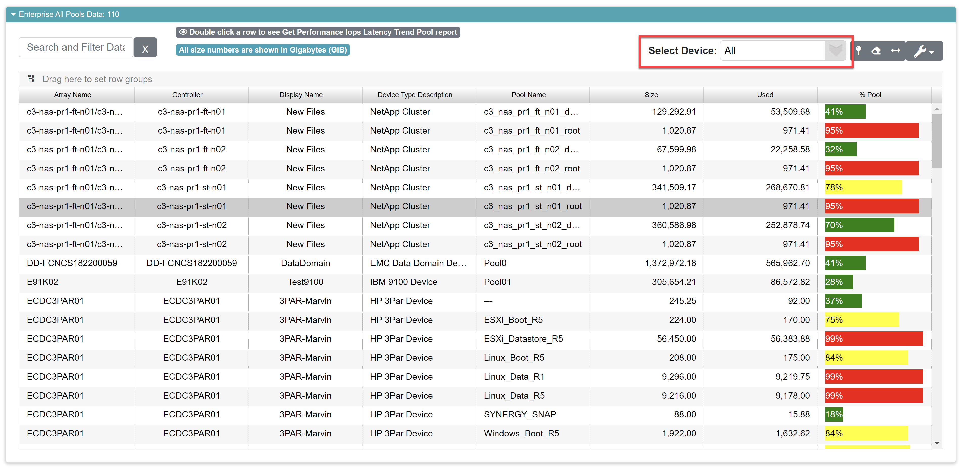
Field |
What it Means |
How Its Calculated |
|---|---|---|
Array Name |
The name of the array where the pool is hosted |
N/A |
Controller |
The controller for the array |
N/A |
Display Name |
The user-friendly name for the array. |
N/A |
Device Type Description |
Displays the device type of the array. |
N/A |
Pool Name |
The name of the pool. |
N/A |
Size |
The total size of the pool. |
This comes directly from the array |
Used |
The total used space of the pool. |
This comes directly from the array. |
% Pool |
The percentage of the used space on the pool. They’re presented as color-coded bars where green indicates you have plenty of space in the pool. Yellow indicates you’re getting close to threshold (usually around 70% full), and red indicates the pool is over threshold. |
The percentage is computed by taking the pool’s used space and dividing by the size of the pool. |
All LUNs
This report shows an exhaustive list of all LUNs within your enterprise storage infrastructure. Since it’s a large list, you can narrow it down to focus on single devices by using the Select Device drop down (outlined below in red). You can also leverage the sorting and grouping features of our customizable data grid to make the data easier to read.
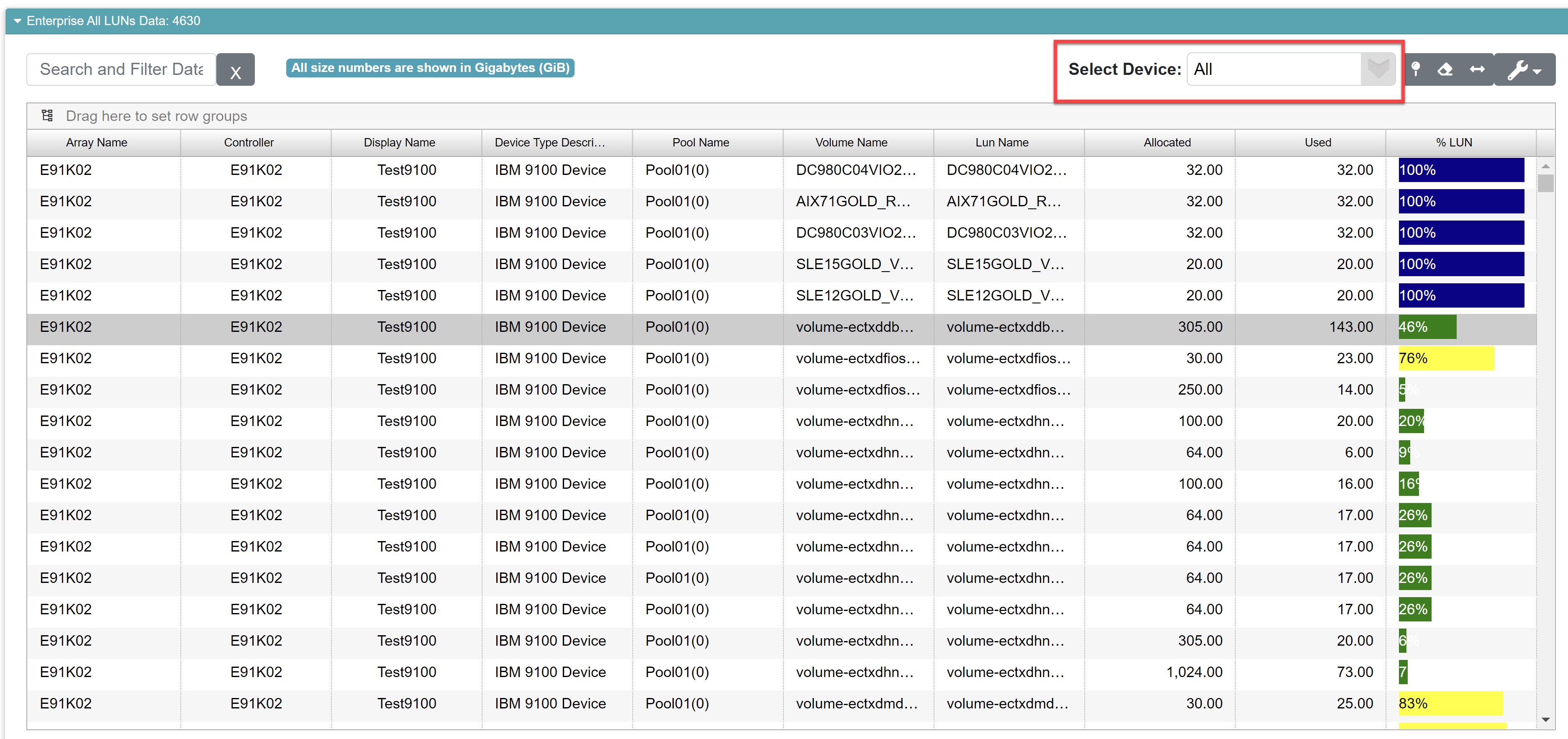
Field |
What it Means |
How Its Calculated |
|---|---|---|
Array Name |
The name of the array where the pool is hosted |
N/A |
Controller |
The controller for the array |
N/A |
Display Name |
The user-friendly name for the array. |
N/A |
Device Type Description |
Displays the device type of the array. |
N/A |
Pool Name |
The name of the LUN. |
N/A |
Size |
The total size of the LUN. |
This comes directly from the array |
Used |
The total used space of the LUN. |
This comes directly from the array. |
% LUN |
The percentage of the used space on the LUN. They’re presented as color-coded bars where green indicates you have plenty of space in the pool. Yellow indicates you’re getting close to threshold (usually around 70% full), and red indicates the pool is over threshold. Purple indicates the LUN is 100% full. |
The percentage is computed by taking the LUN’s used space and dividing by the size of the LUN. |
All Shares
This report shows an exhaustive list of all shares within your enterprise storage infrastructure. Since it’s a large list, you can narrow it down to focus on single devices by using the Select Device drop down (outlined below in red). You can also leverage the sorting and grouping features of our customizable data grid to make the data easier to read.
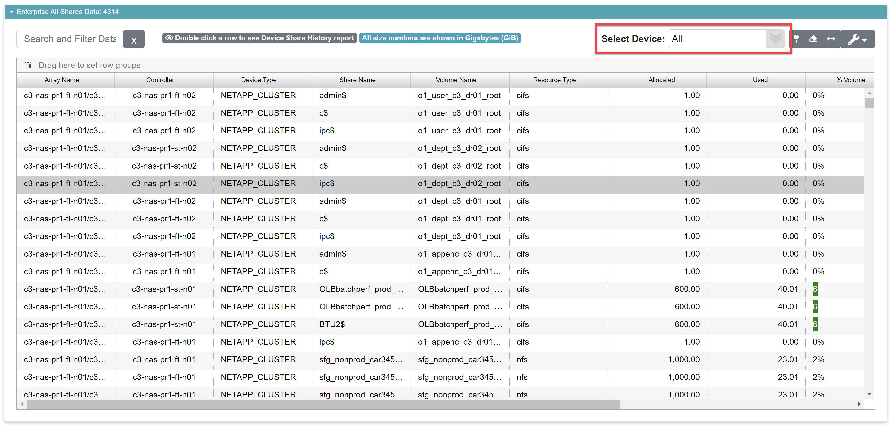
Field |
What it Means |
How Its Calculated |
|---|---|---|
Array Name |
The name of the array where the share is hosted |
N/A |
Controller |
The controller for the array |
N/A |
Display Name |
The user-friendly name for the array. |
N/A |
Device Type Description |
Displays the device type of the array. |
N/A |
Pool Name |
The name of the share. |
N/A |
Size |
The total size of the share. |
This comes directly from the array |
Used |
The total used space of the share. |
This comes directly from the array. |
% LUN |
The percentage of the used space on the share. They’re presented as color-coded bars where green indicates you have plenty of space in the pool. Yellow indicates you’re getting close to threshold (usually around 70% full), and red indicates the pool is over threshold. Purple indicates the LUN is 100% full. |
The percentage is computed by taking the share’s used space and dividing by the size of the share. |